
Sherry
A distinctive visual identity and packaging system for an ice cream brand.
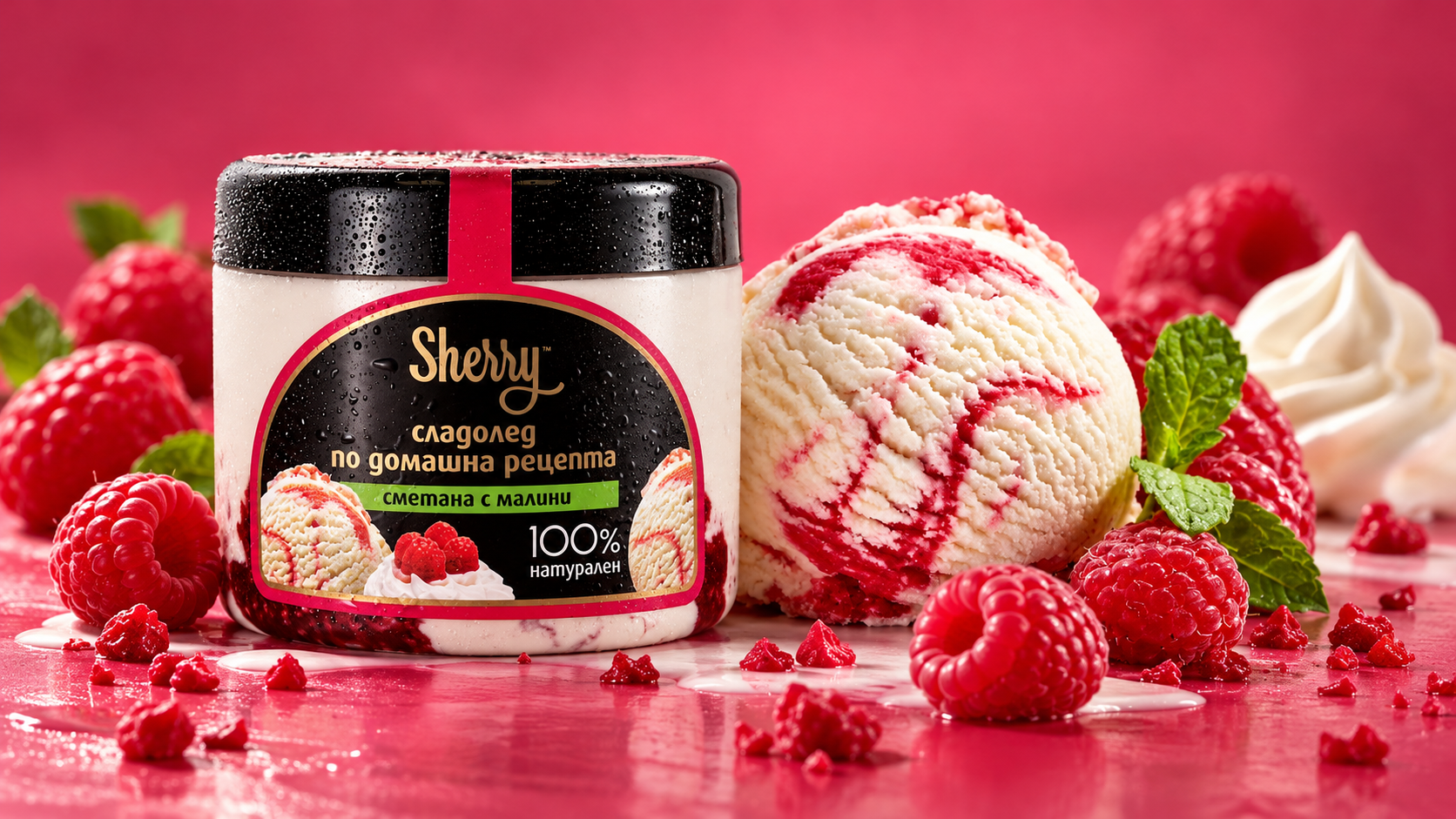
The Project
Sherry is an ice cream brand inspired by the appeal of homemade recipes and distinctive flavours.
The project involved developing the brand identity and a cohesive packaging system that brings together expressive typography, rich colour and appetising product imagery.
The visual approach combines a recognisable brand signature with individual flavour identities, creating consistency across the range without sacrificing variety.
A Distinctive Brand Character
The Sherry identity is built around a flowing gold script logotype that brings warmth and personality to the brand.
Combined with dark packaging surfaces, refined gold detailing and vivid flavour colours, the identity creates a recognisable visual character across different products and applications.

One Identity, Multiple Flavours
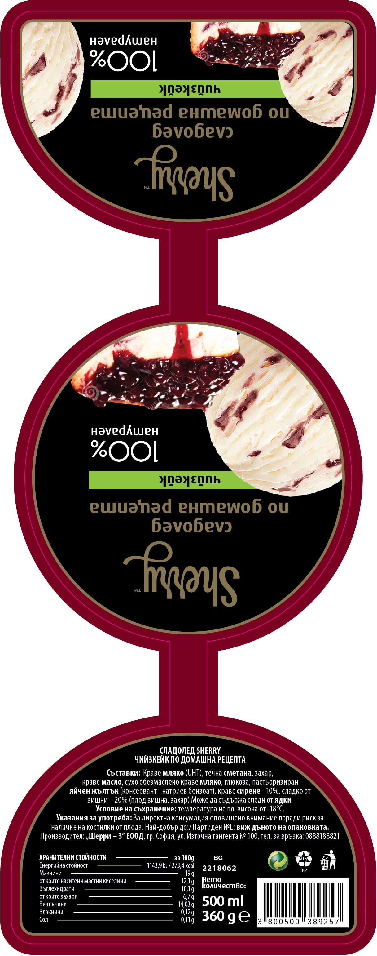
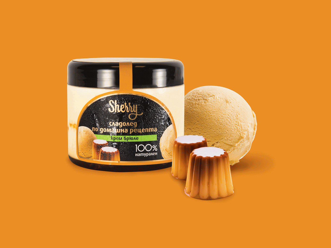
The packaging system follows a consistent visual structure, keeping the Sherry logotype, product information and overall composition familiar across the range.
Each flavour receives its own colour treatment and ingredient imagery, making the products easy to distinguish while preserving a unified brand appearance.
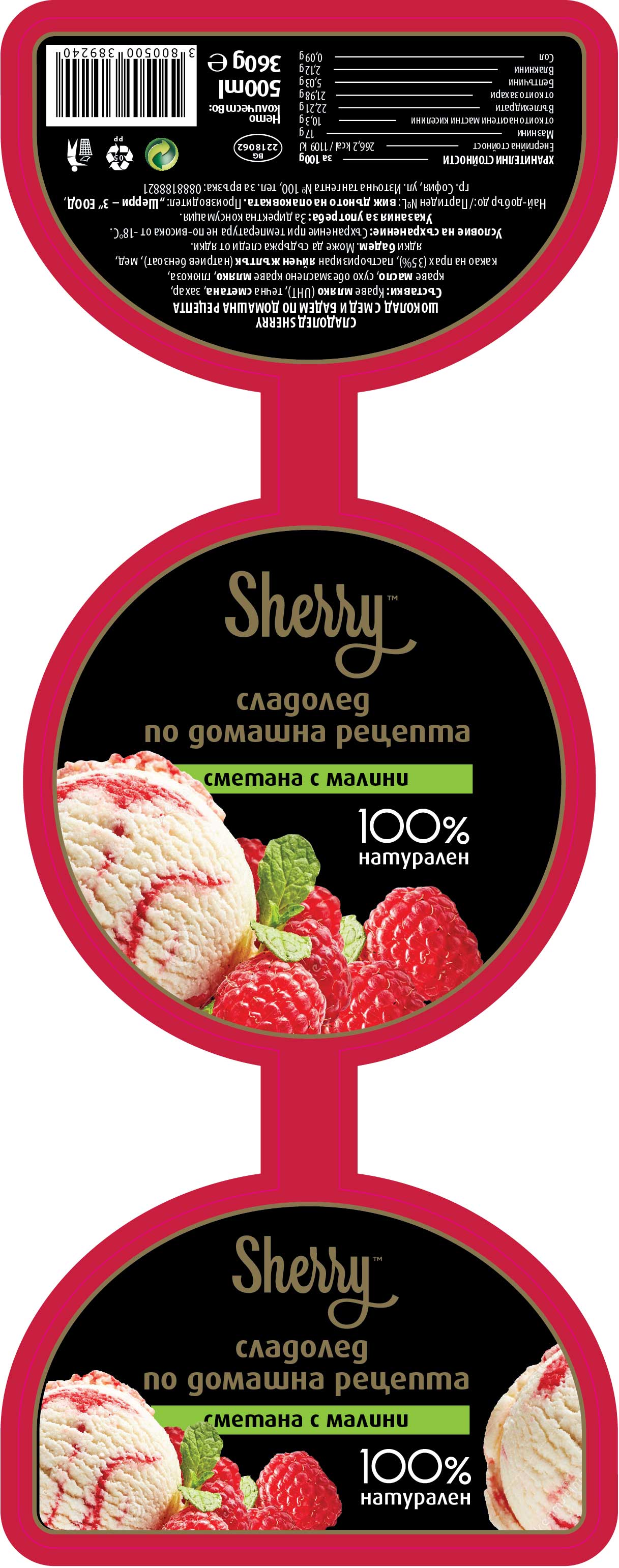
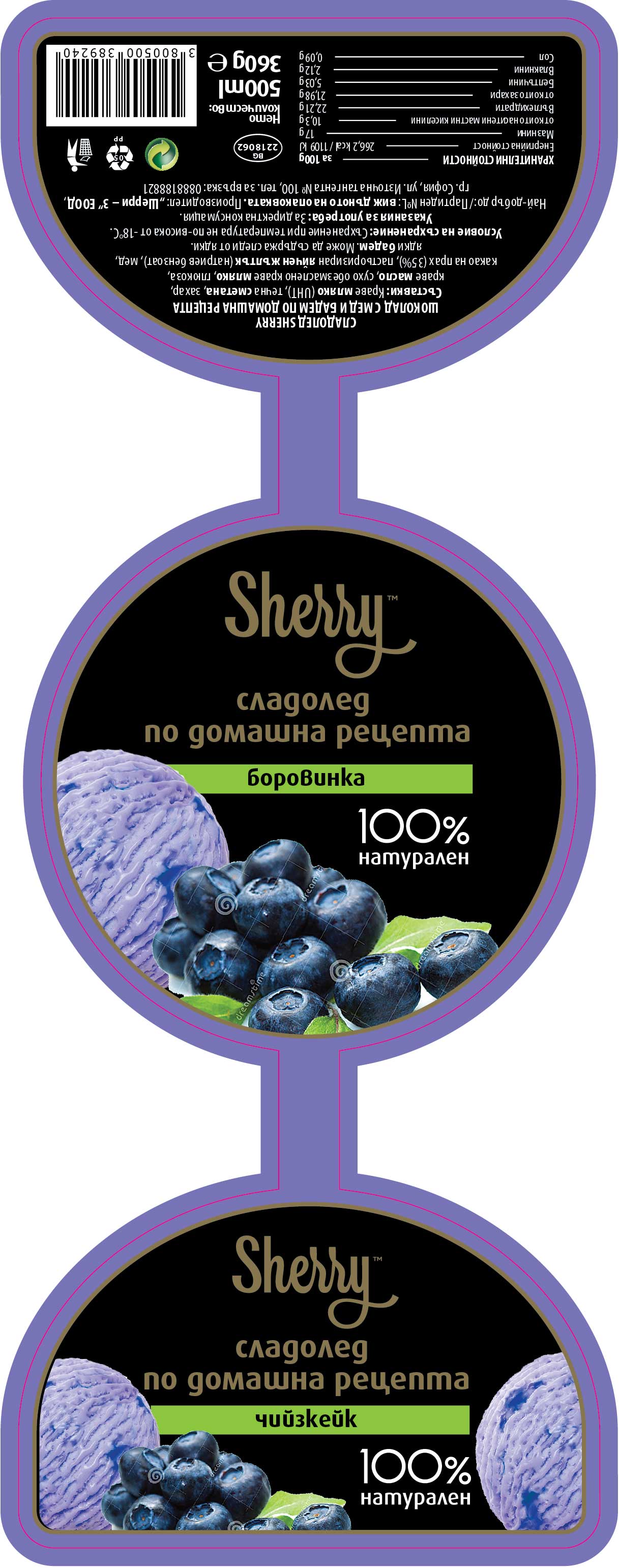
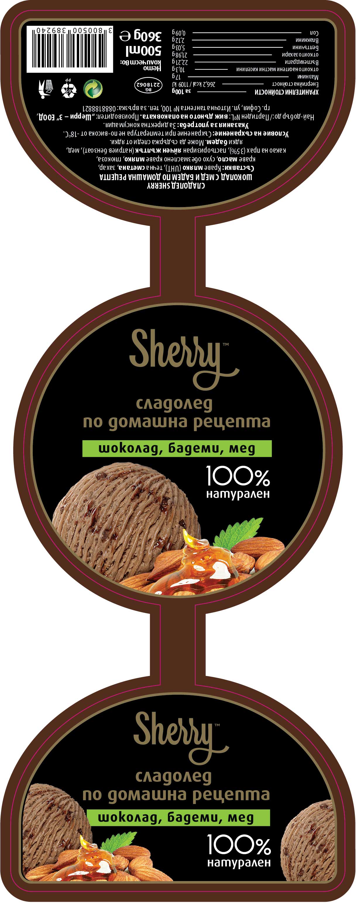
Flavours in Focus
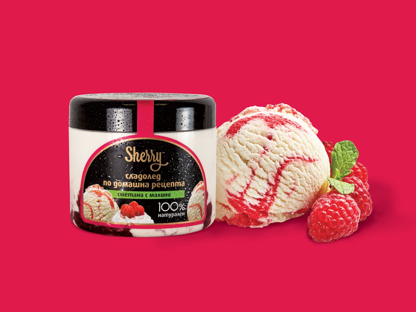
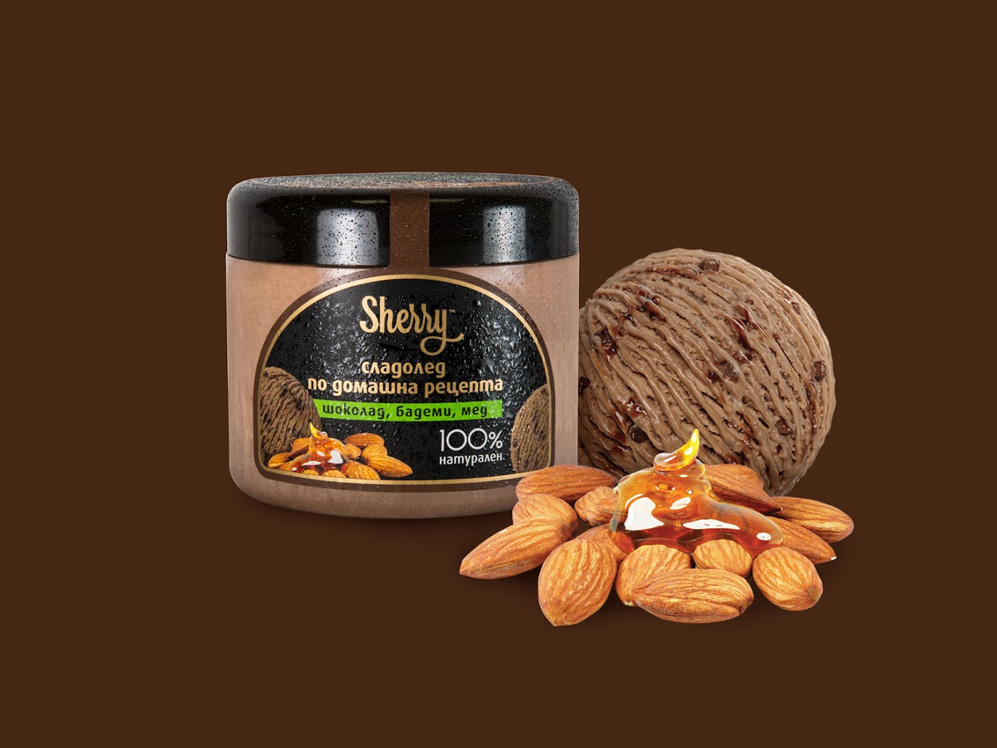
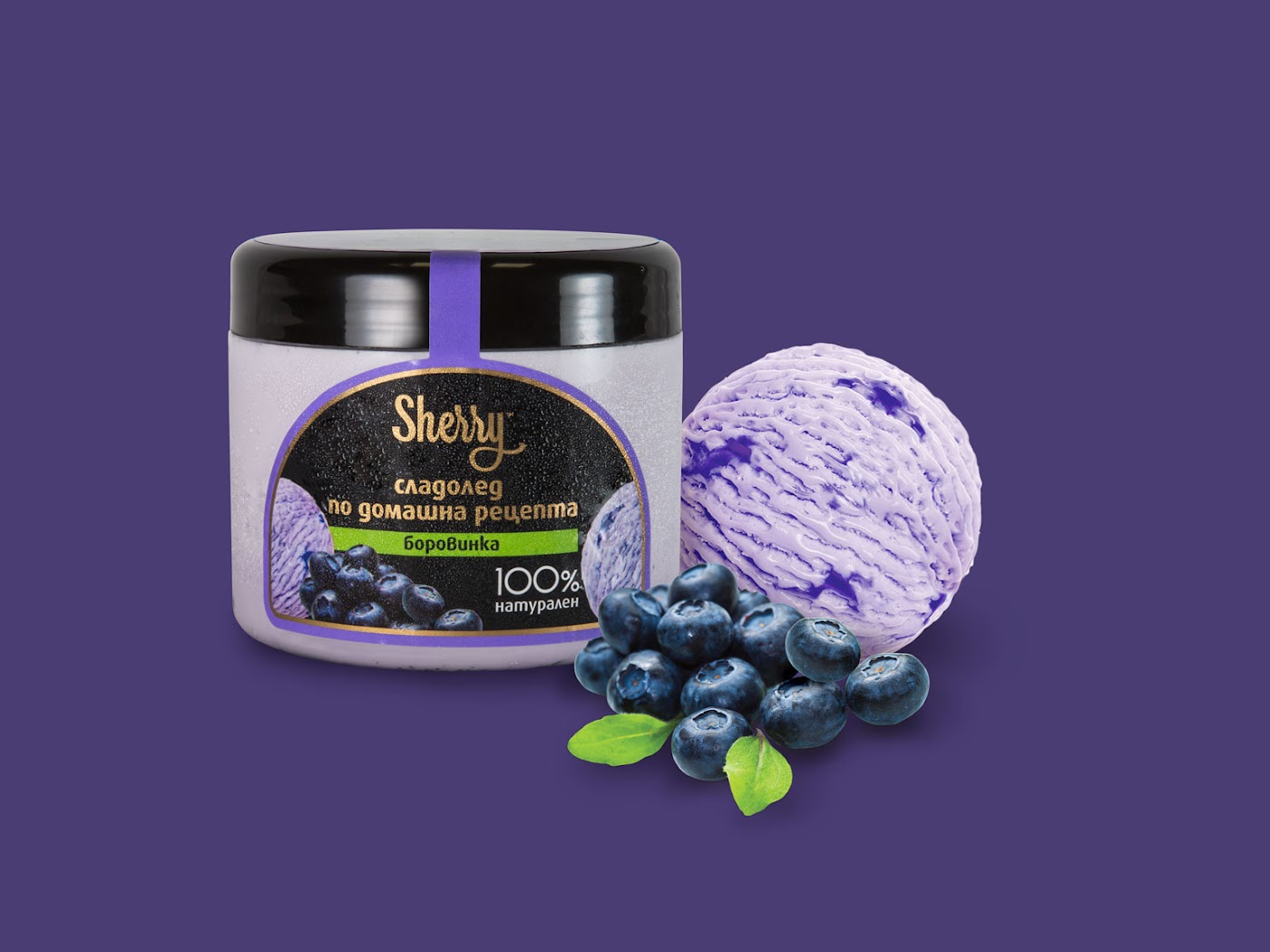
The product compositions extend the packaging identity through expressive colour, ingredient imagery and carefully balanced arrangements.
Each visual reinforces the character of its flavour while maintaining the distinctive Sherry packaging as the central element.
Beyond the Packaging
The visual identity extends into supporting brand materials, maintaining consistency through the Sherry logotype, restrained colour palette and distinctive graphic character.

Let’s connect.
Open to UX/UI, product design and AI experience design opportunities.