
AHAT / Ахат
A brand identity refresh, a packaging system and printed communication for a Bulgarian range of nuts, seeds and dried fruit.
Overview
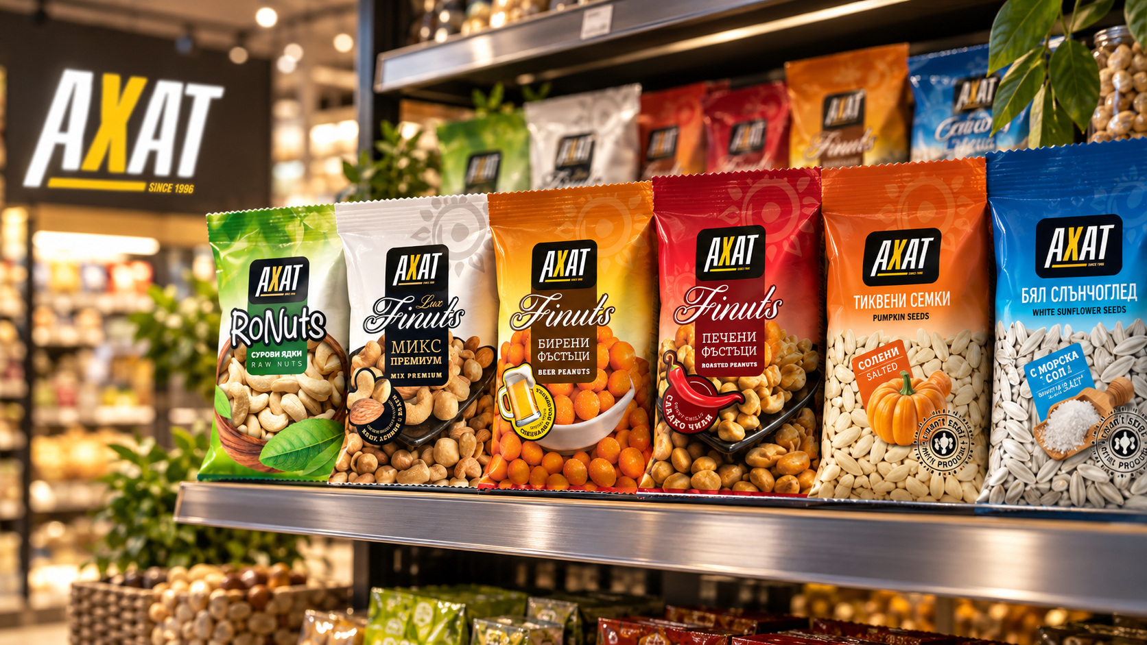
AHAT is a line of nuts, seeds and dried fruit produced in Plovdiv. The work covered a refresh of the existing brand mark and a packaging system for the full range — from everyday roasted peanuts and sunflower seeds to a premium Lux line.
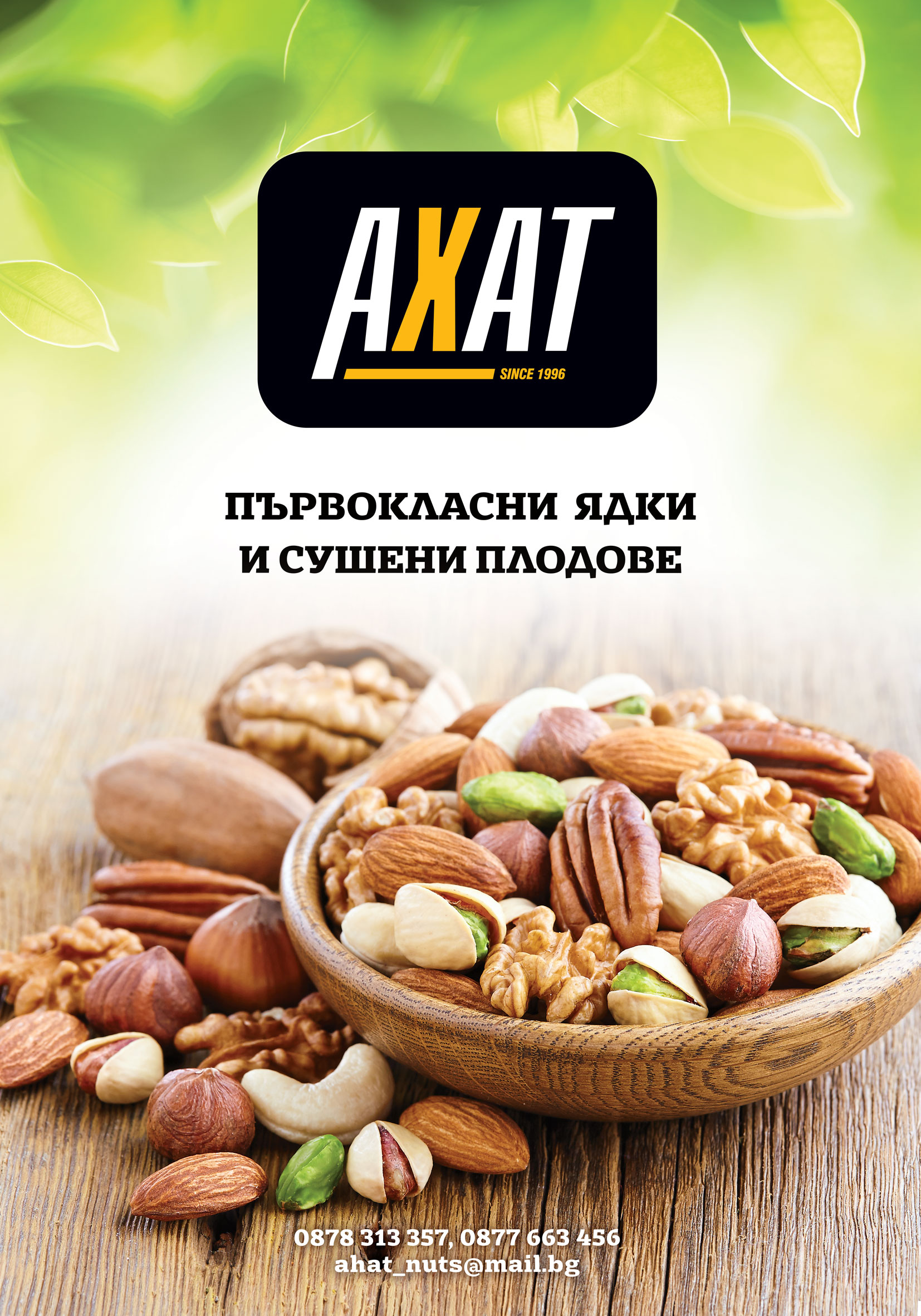
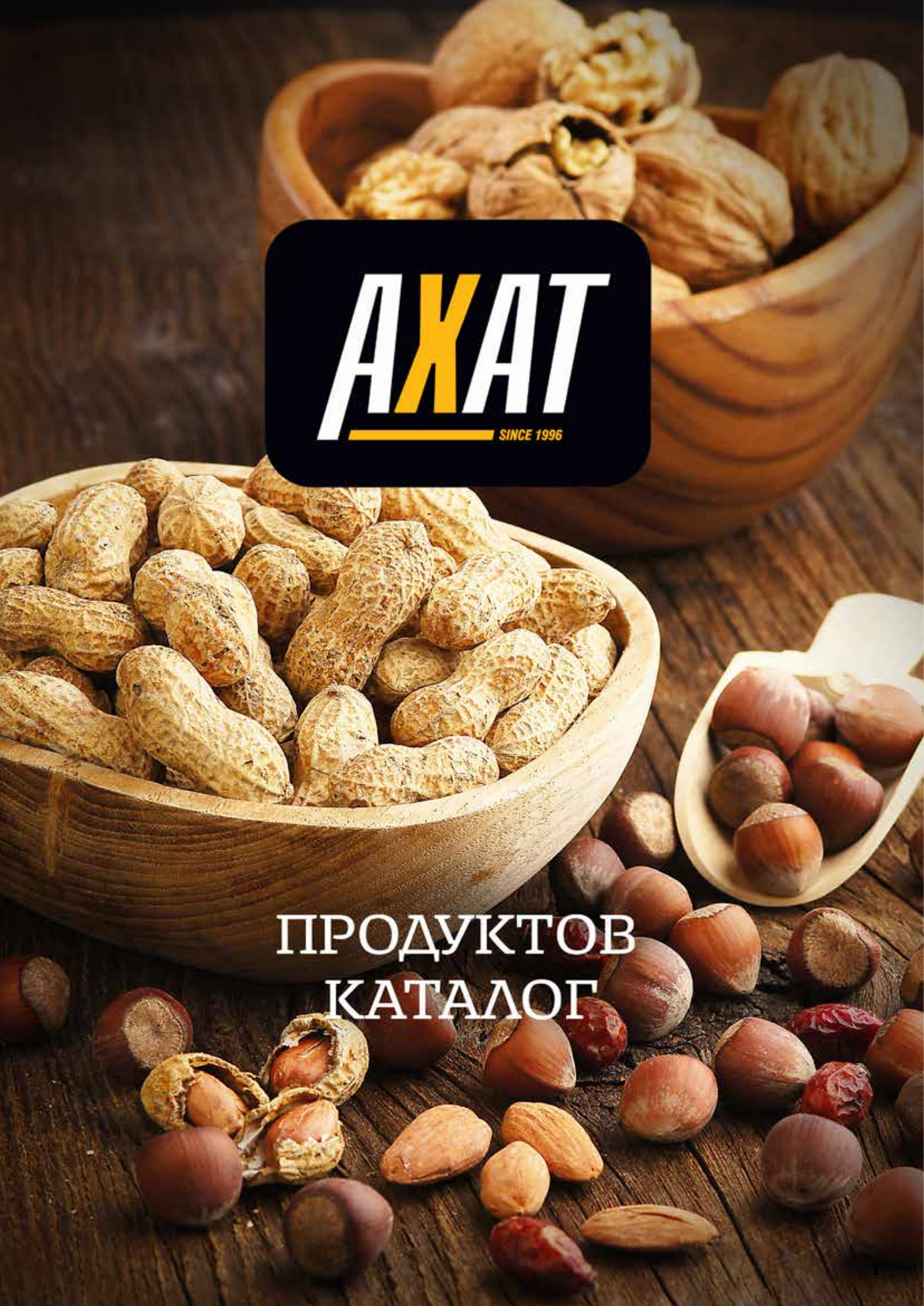
The same visual language carries into a product catalog, a poster, a shelf display box, business cards and vehicle branding, with pack formats from 70 g to 1 kg.
Visual Identity
A refresh of the existing AHAT logotype rather than a new mark. The recognisable form stays; proportions, detailing and legibility were refined.
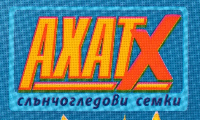 Before
 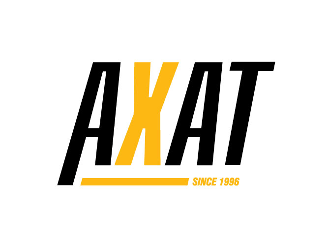 After
After 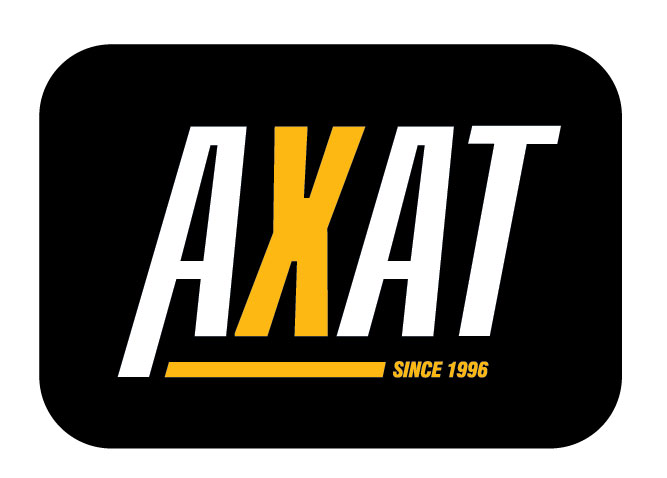 Alternate
 The refresh keeps the bold character of the original logo, but makes it cleaner, sharper and easier to use across packaging and print materials.
Packaging System
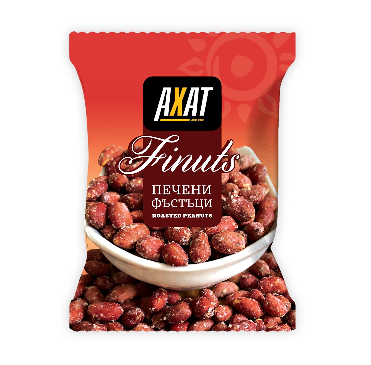
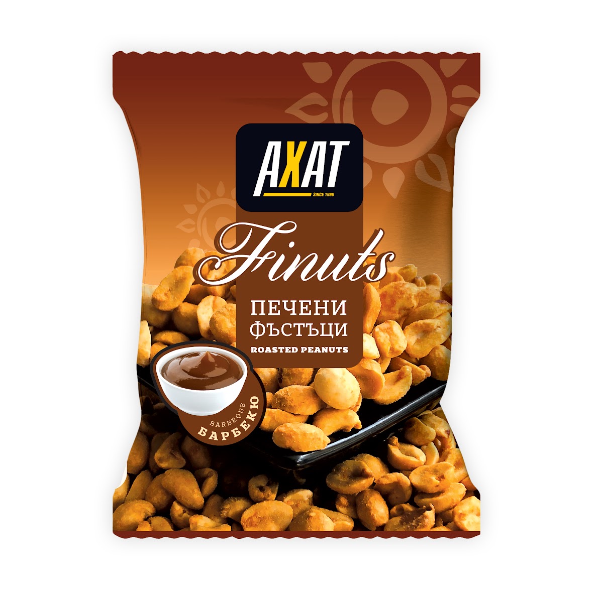
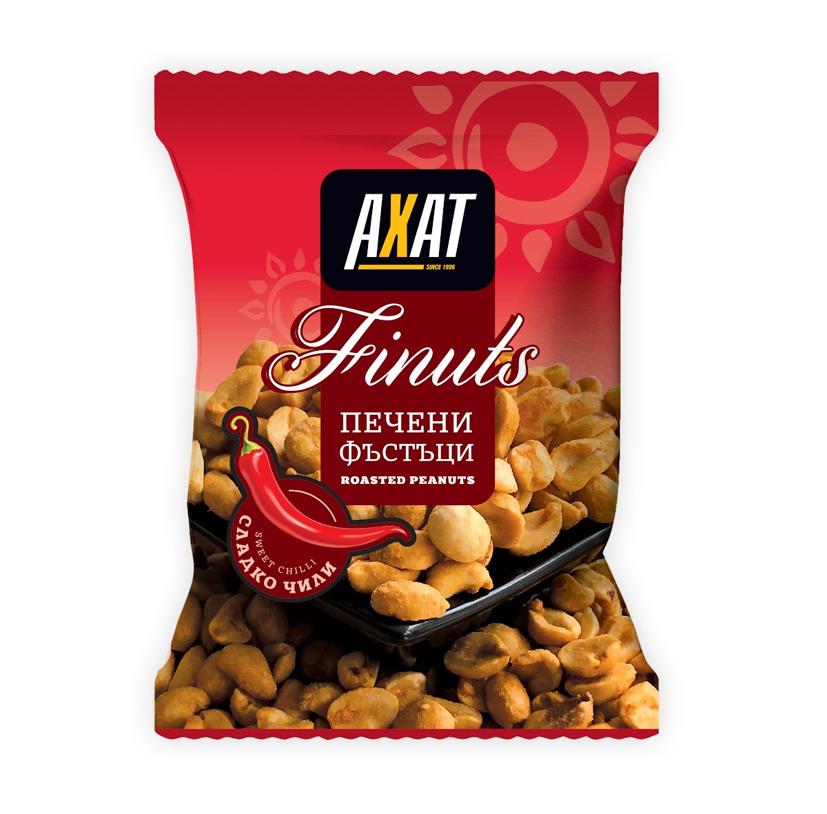
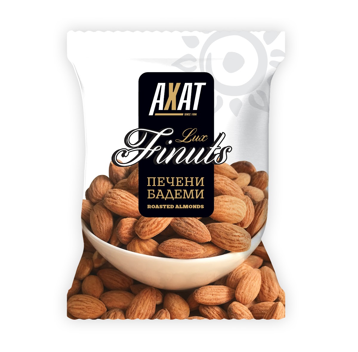
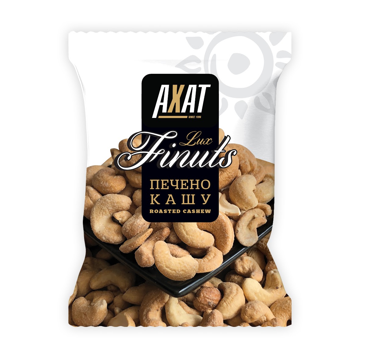
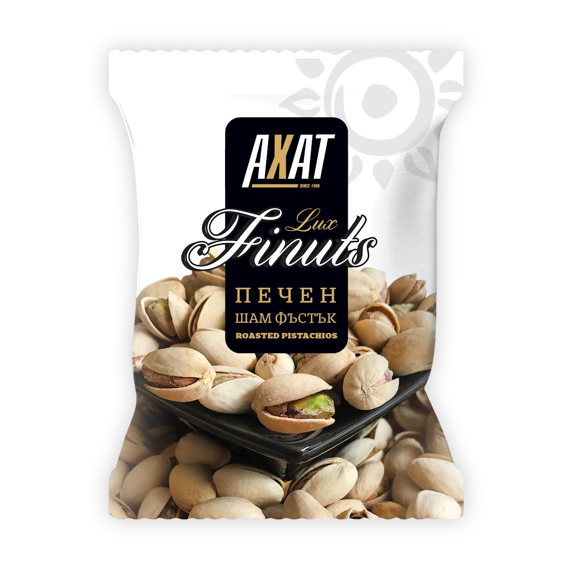
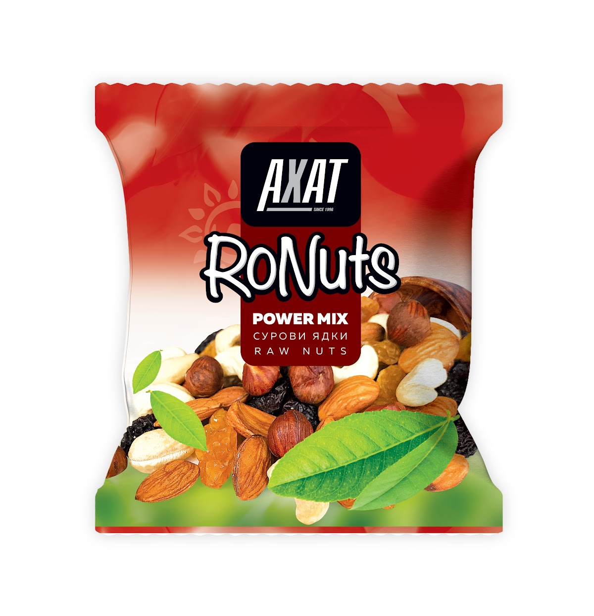
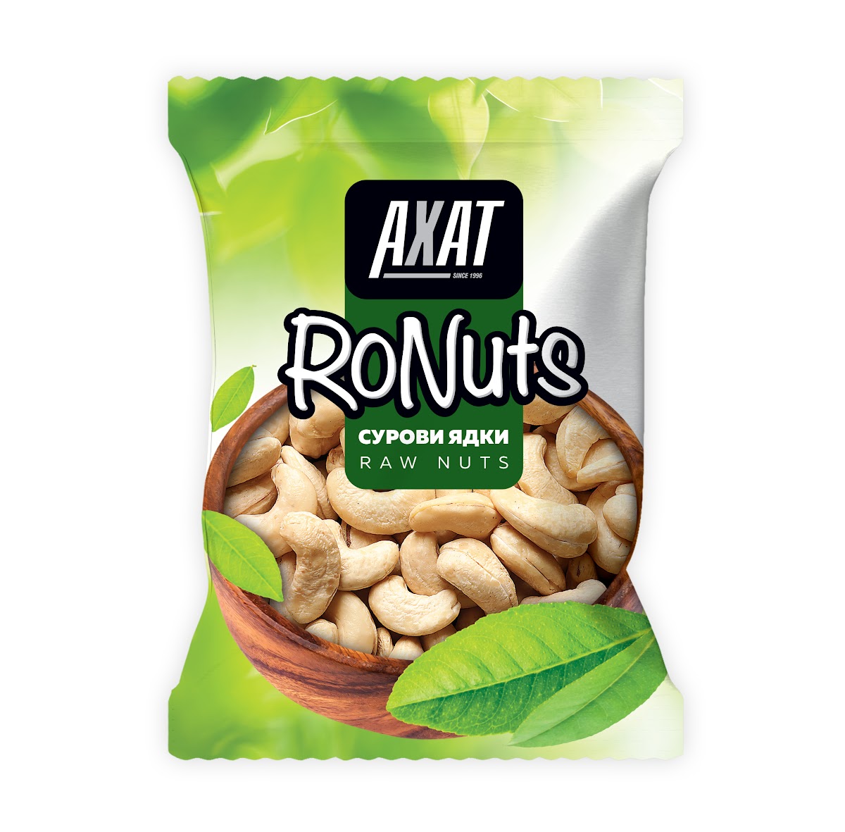
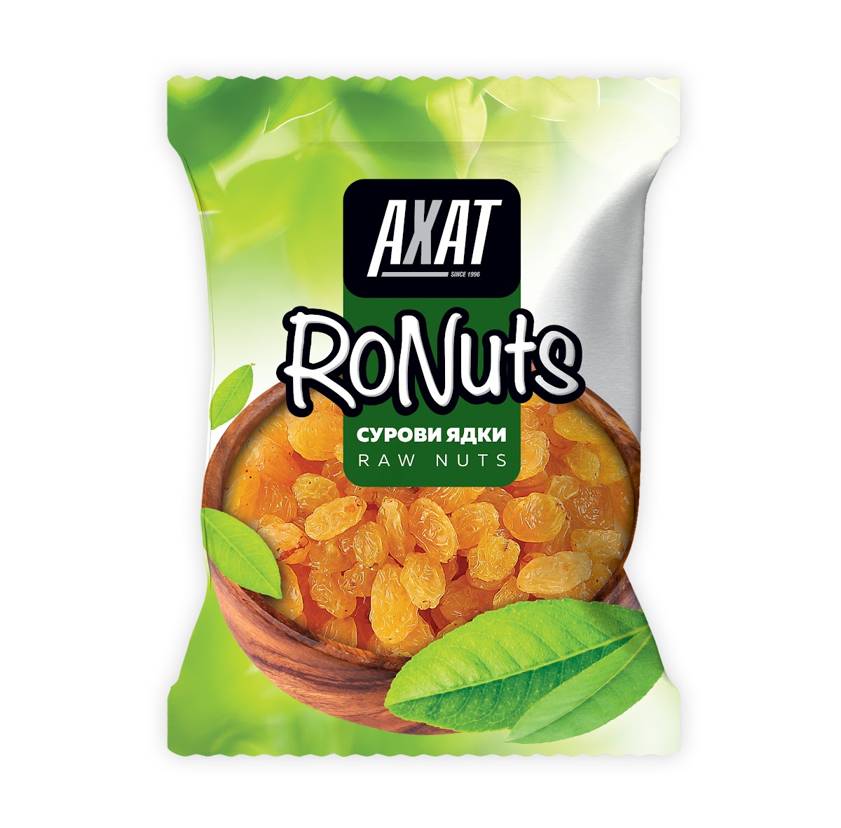
Four product lines under one brand. A selection from each is shown below.
Seeds
Sunflower and pumpkin seeds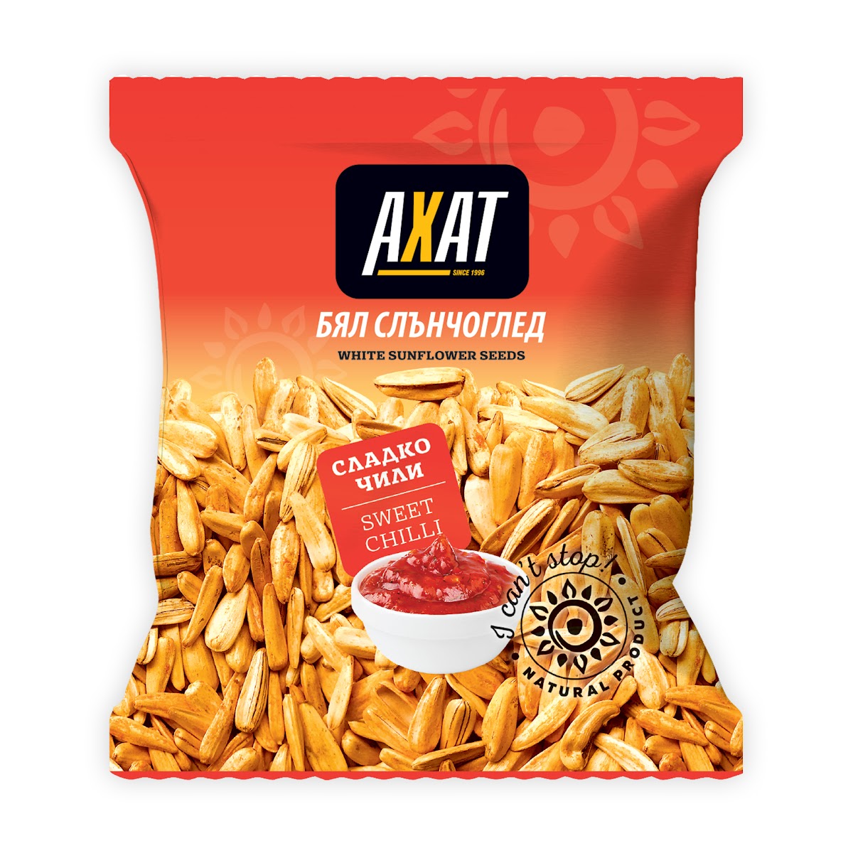
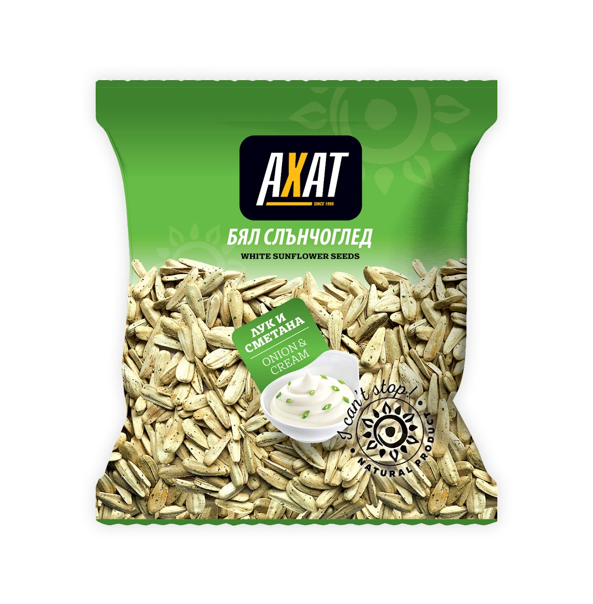
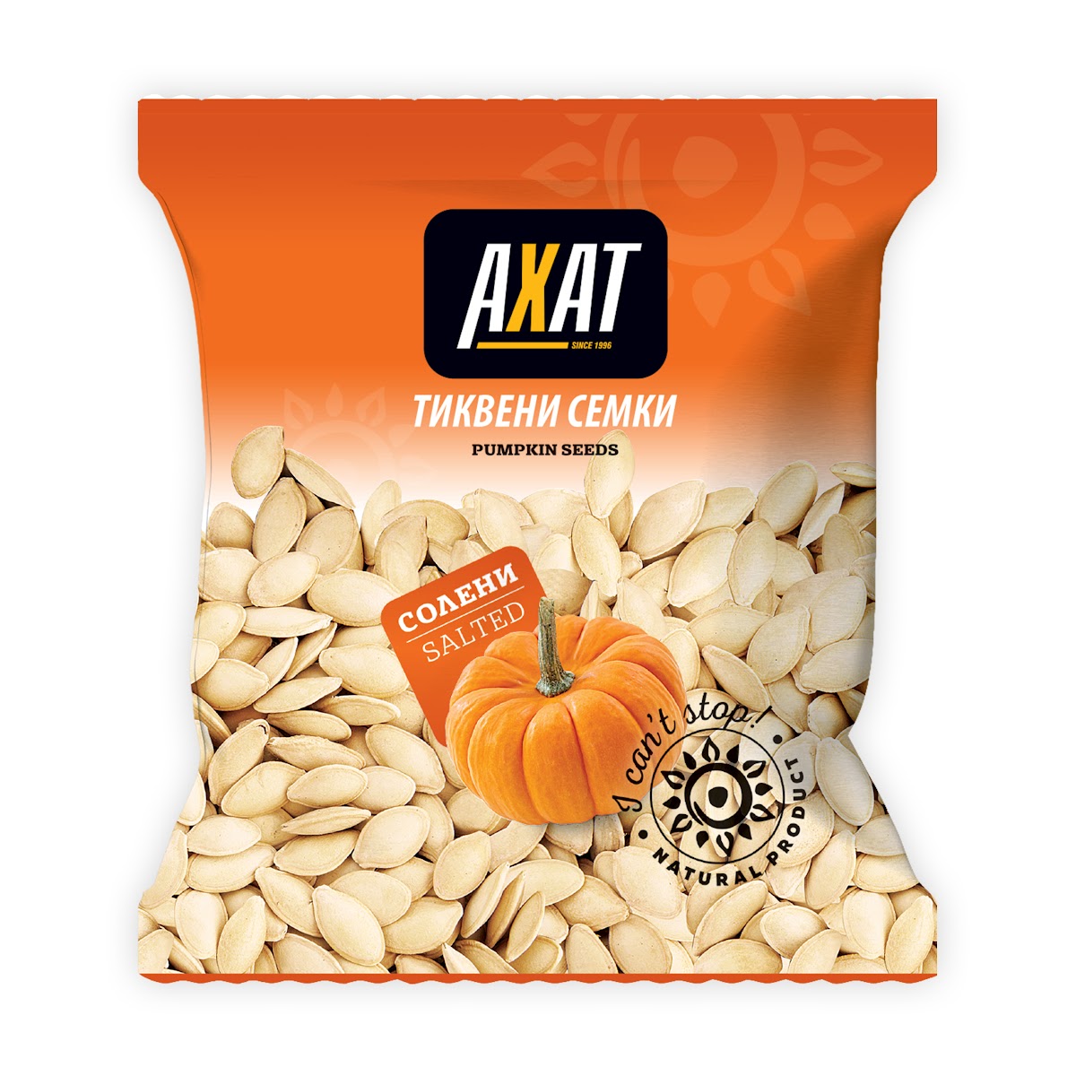
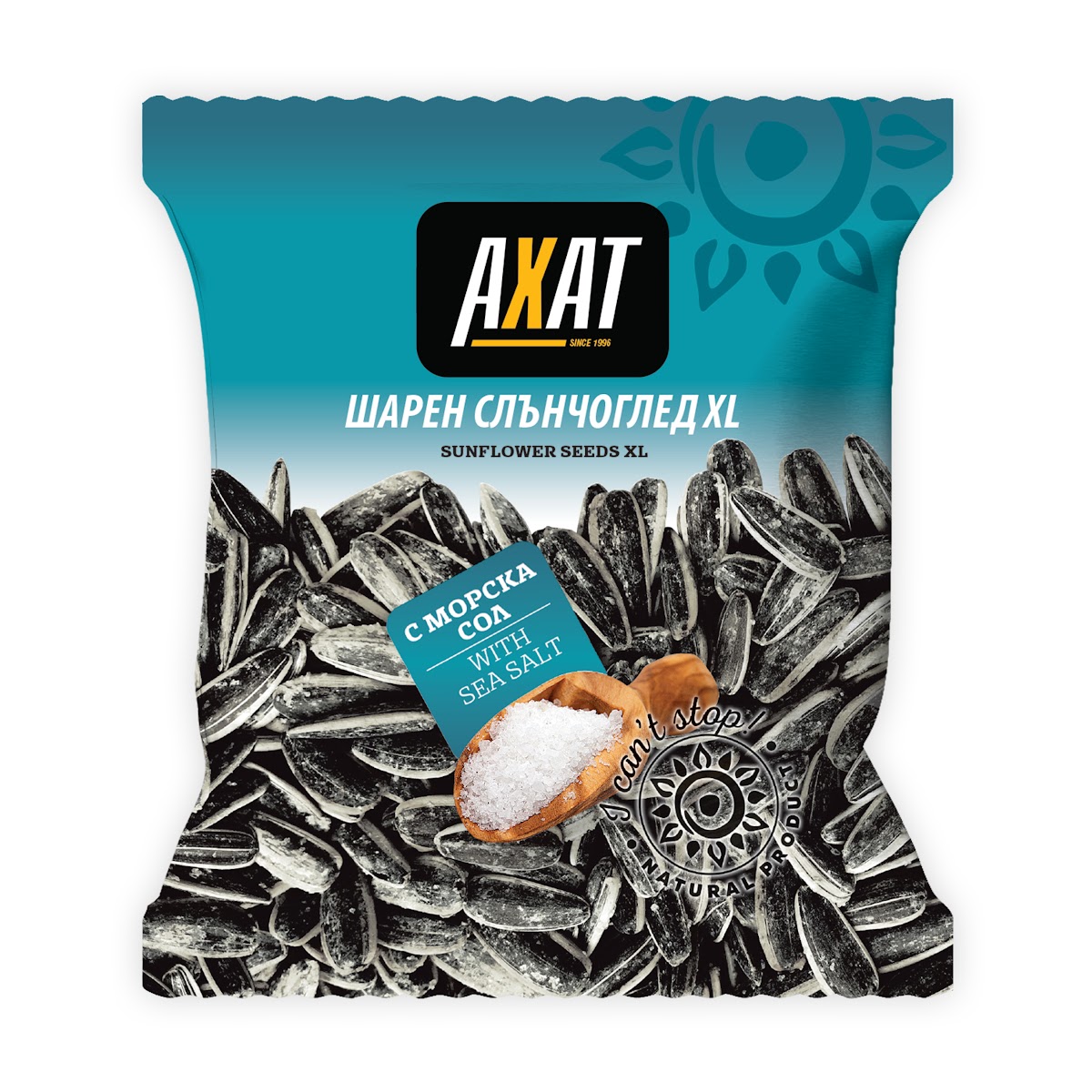
Roasted
Peanuts, corn and mixes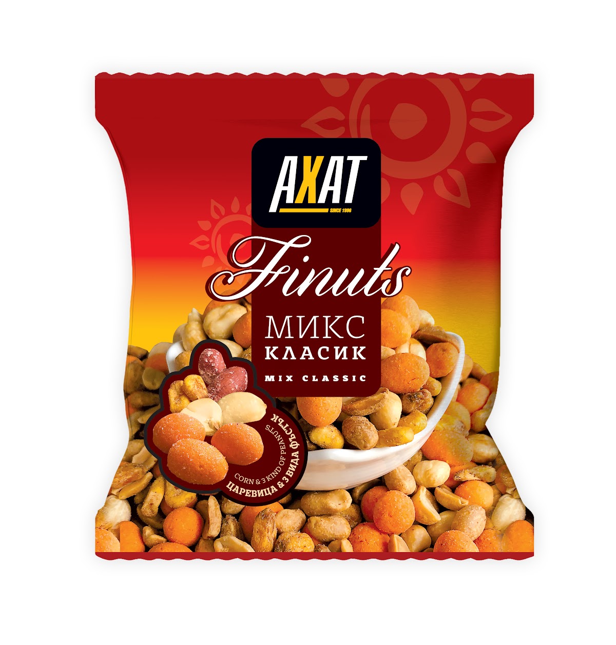
Lux
Premium roasted nuts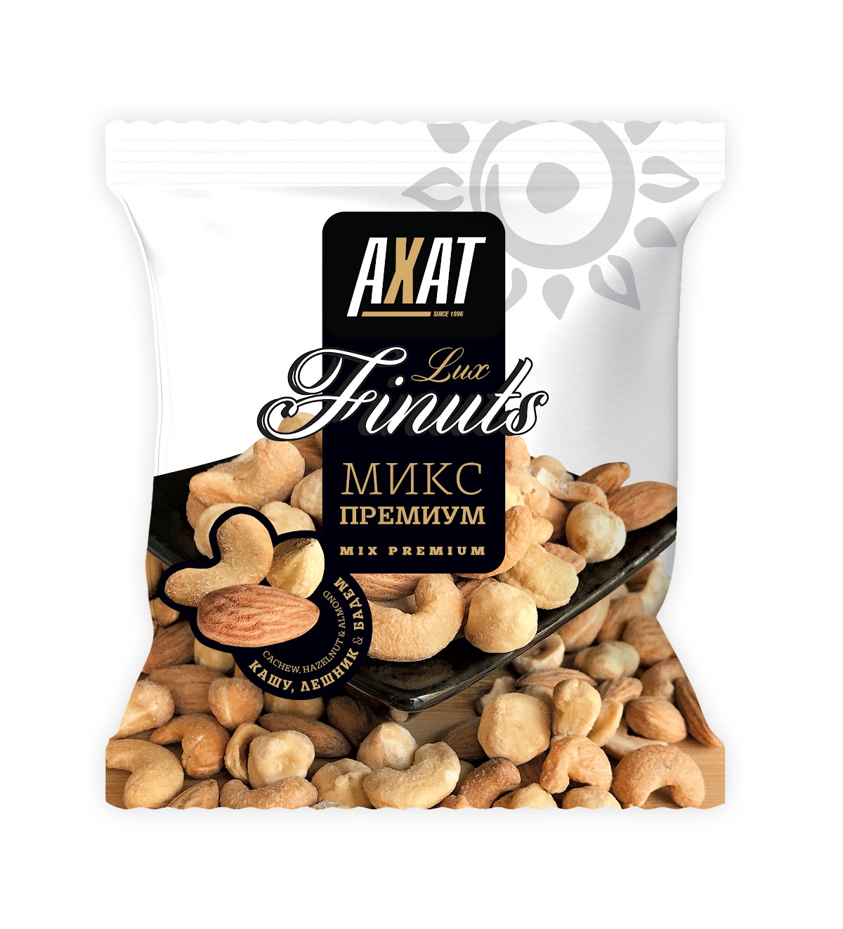
Raw & Dried Fruit
Raw nuts, mixes and raisins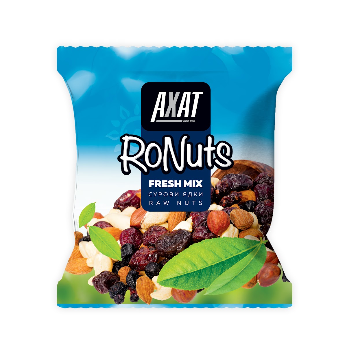
Print & Communication
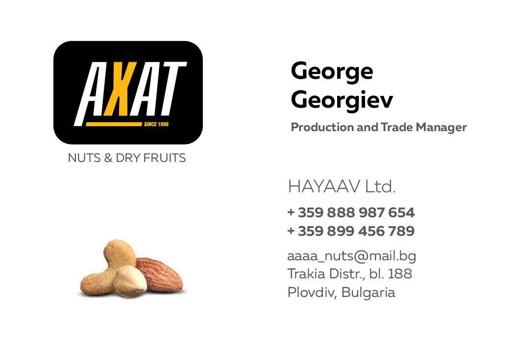
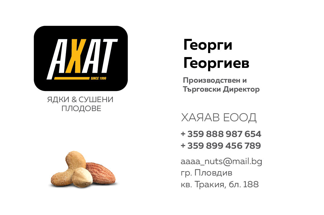
A poster, a product catalog, a shelf display box and business cards.
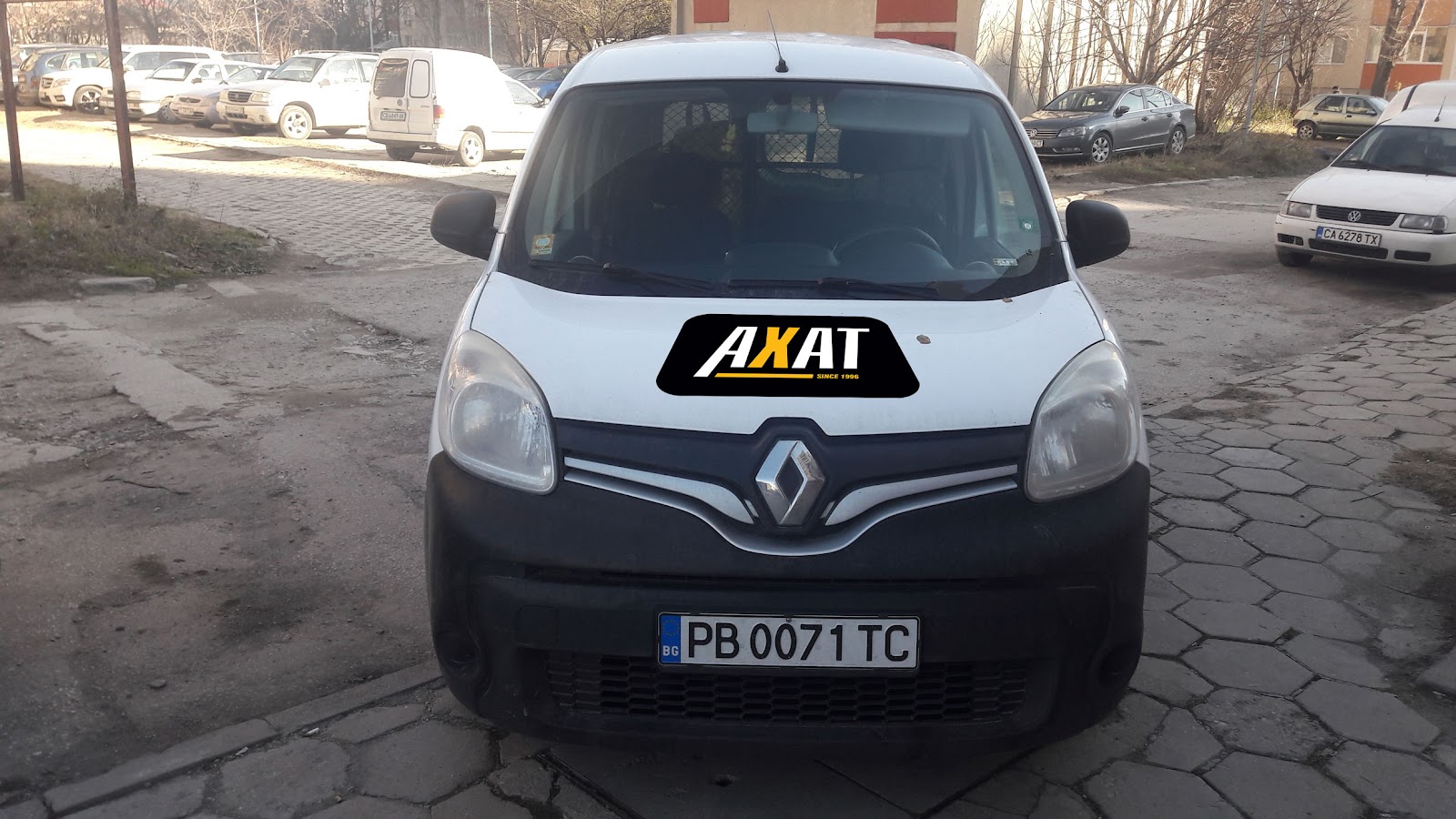
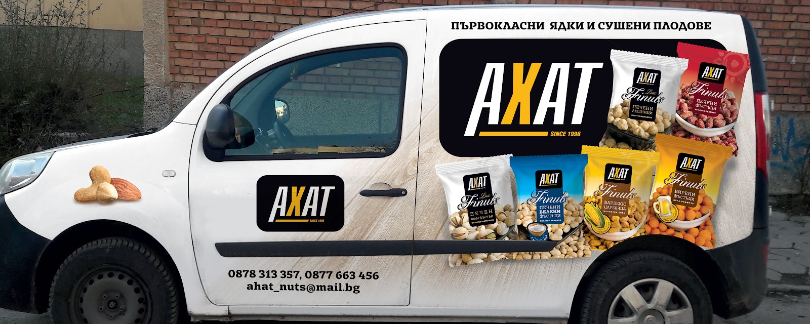
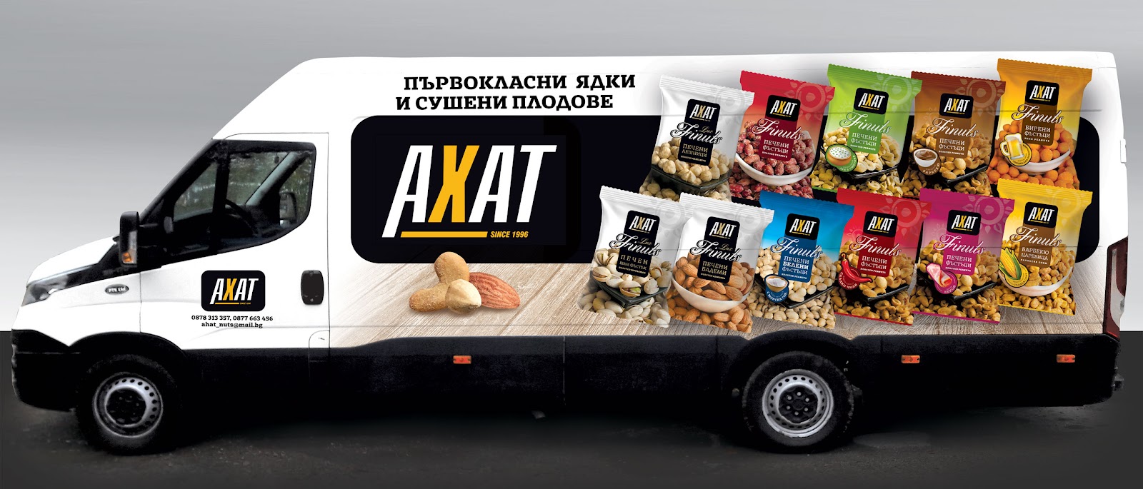
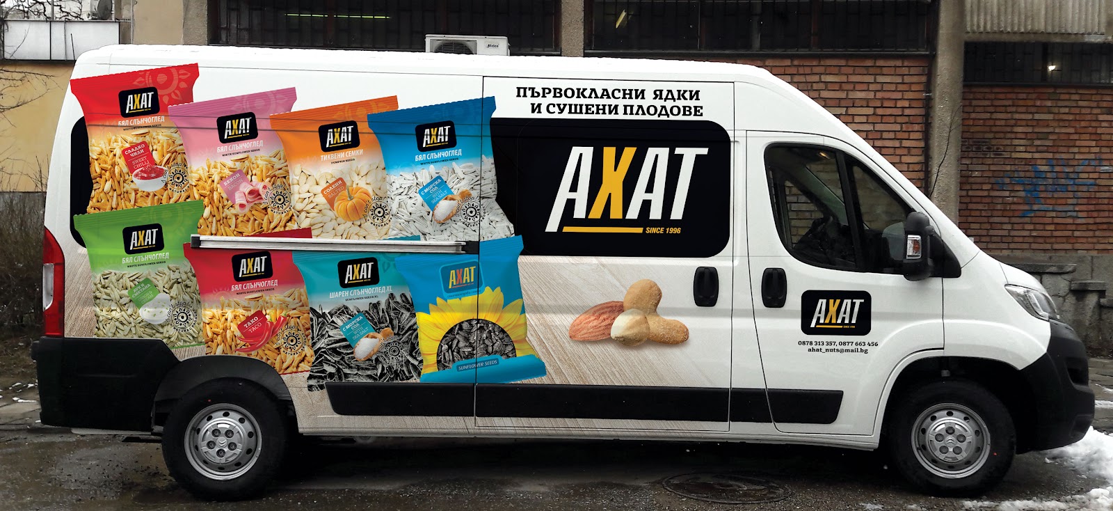
Vehicle Branding
Delivery vehicle graphics across three van models.
Deliverables
Role
A refresh of the existing brand mark, the packaging system across all four product lines, and its application to print and vehicle graphics.
[Placeholder — confirm scope: e.g. in-house or agency, sole designer or team, whether photography and pre-press were included.]
Let’s connect.
Open to UX/UI, product design and AI experience design opportunities.