
Victoria Ice Tea
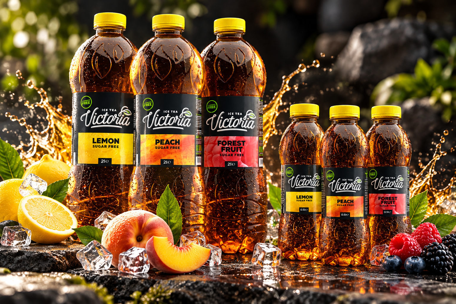
A distinctive packaging system for a sugar-free iced tea range.
The Project
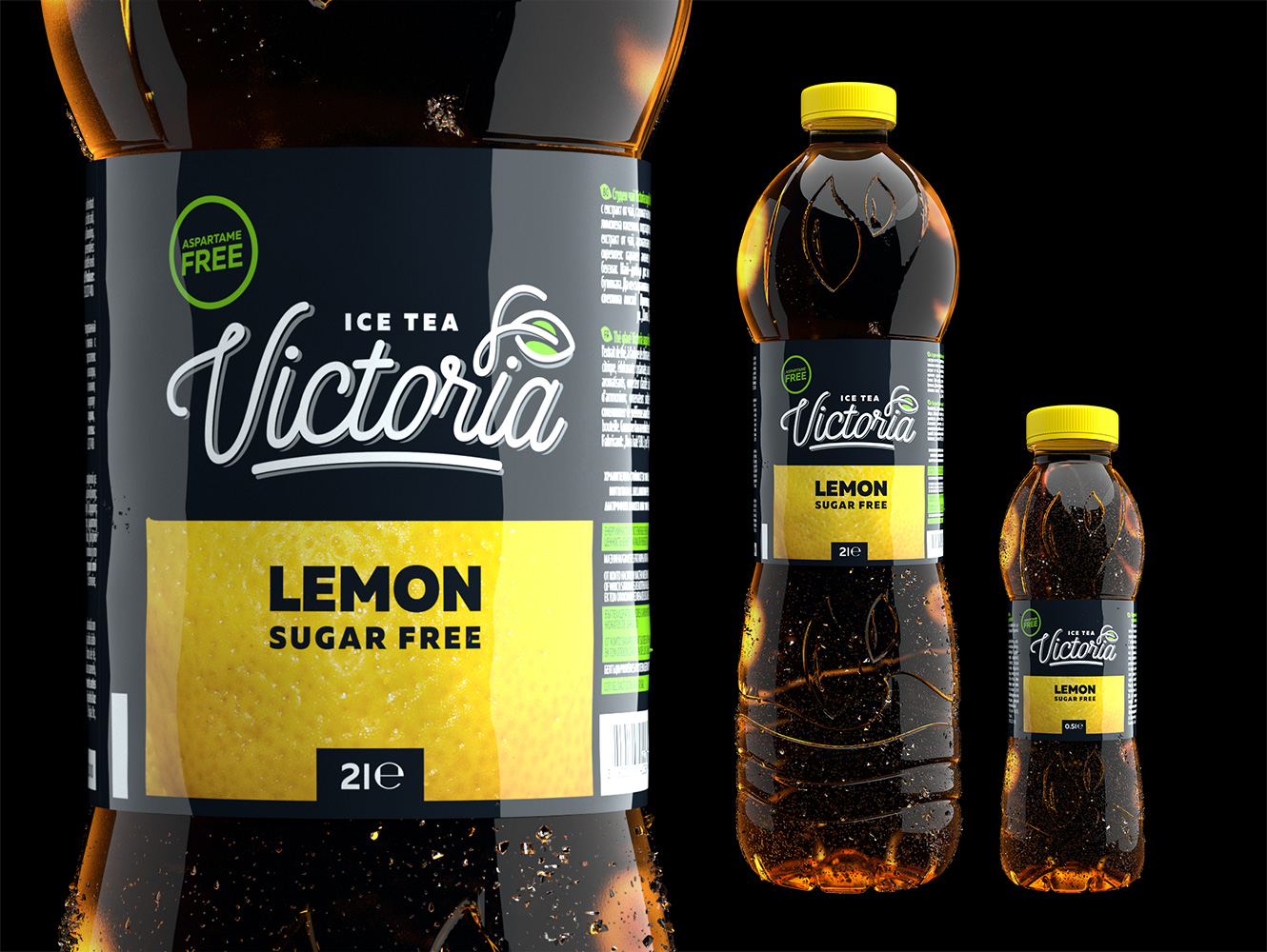
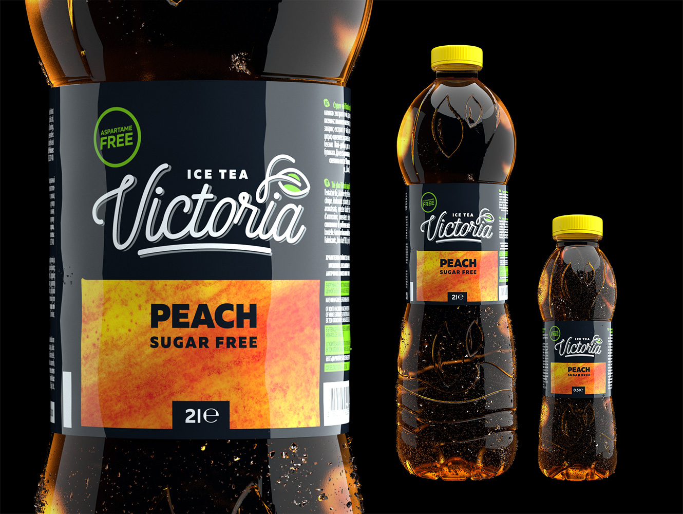
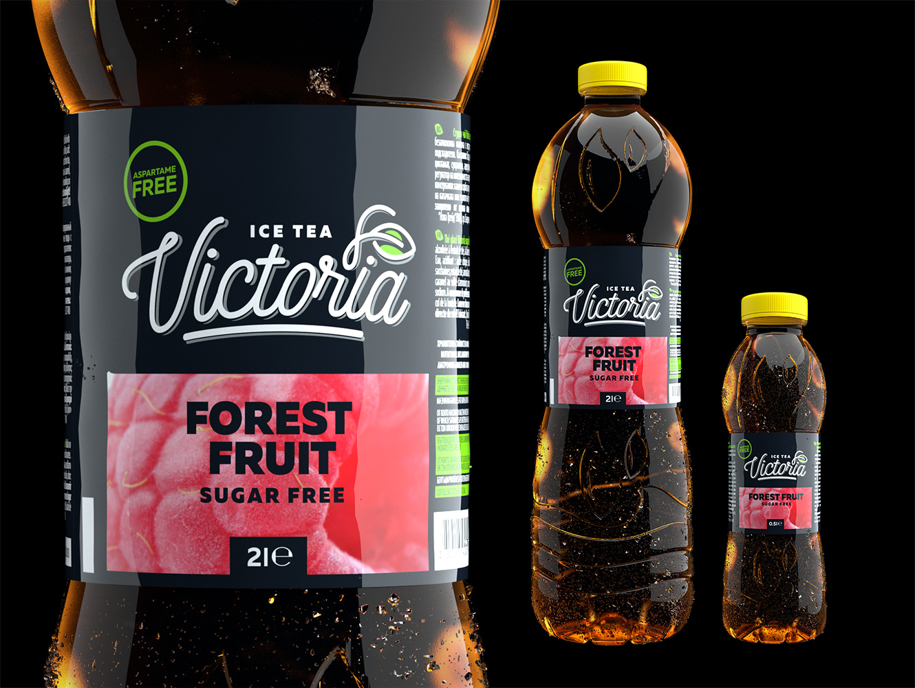
Victoria Ice Tea is a range of sugar-free iced teas available in three flavours and two bottle sizes.
The packaging combines a distinctive brand signature, a dark visual foundation and vibrant flavour-specific graphics to establish a recognisable identity across the product range.
A Fresh Take on Contrast
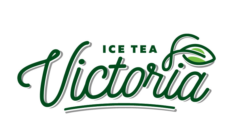
The Victoria identity brings together expressive script lettering and a clean, high-contrast packaging design.
A prominent white logotype stands against the dark label, while green accents introduce a fresh visual character. Bold typography and colourful fruit-inspired graphics make the individual flavours easy to distinguish.
One Identity, Two Formats
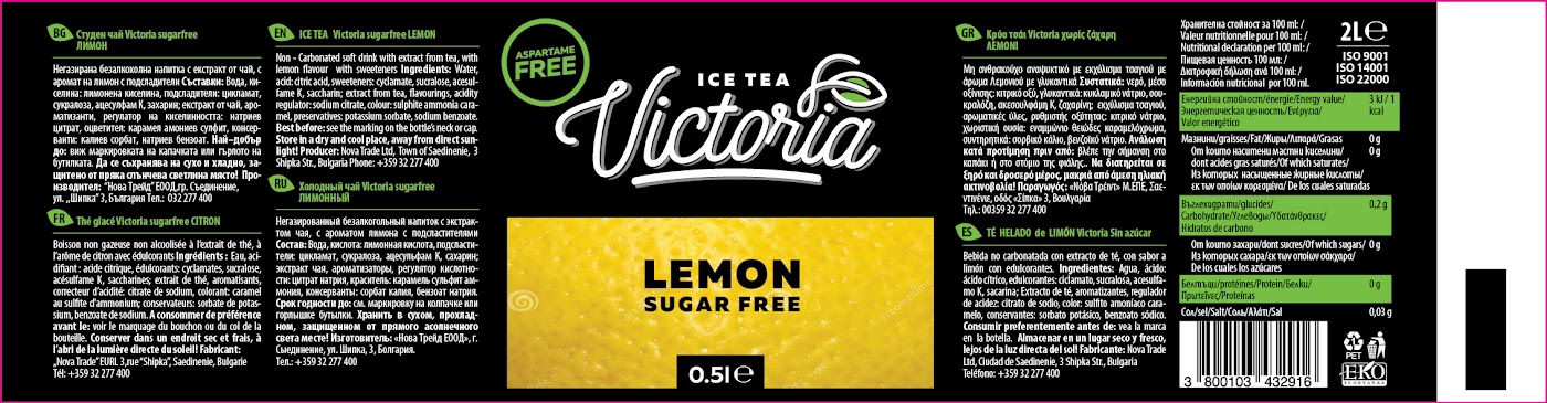
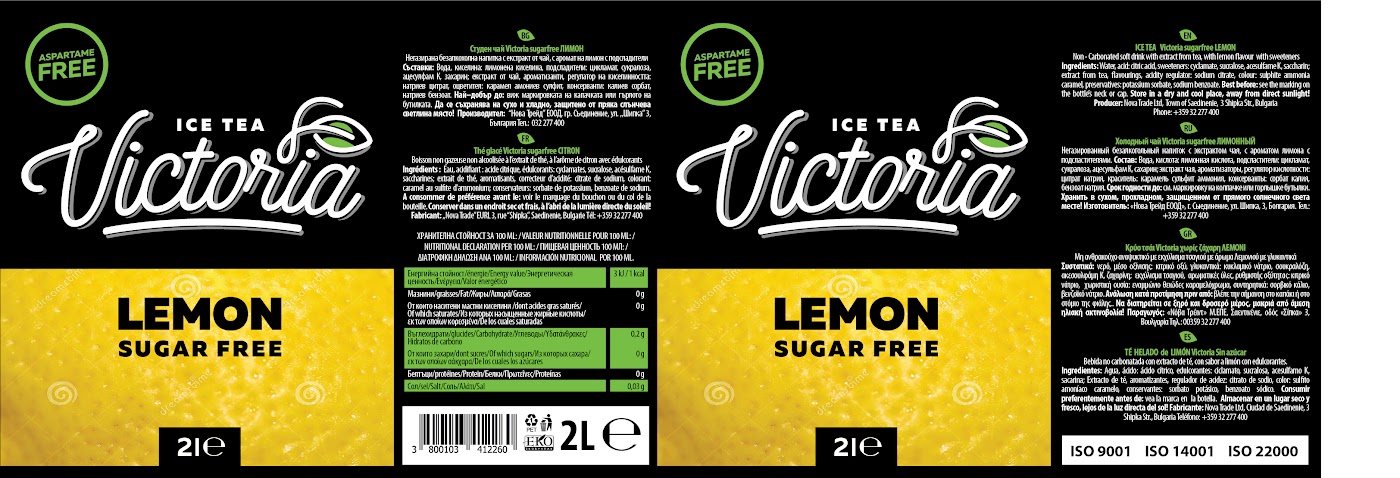
The label system was developed for both 0.5-litre and 2-litre bottles, maintaining a consistent relationship between the logotype, flavour identification and product information.
The dark background establishes visual continuity, while bright colour panels distinguish the flavours without disrupting the overall identity.
Three Flavours, One Visual Language
The flavour range uses a shared graphic structure with distinct colour treatments.
Lemon is identified through vibrant yellow, Peach through warm orange, and Forest Fruit through rich pink and red tones.
Together, the three variations form a cohesive and easily recognisable product family.
Extending the Identity into Retail
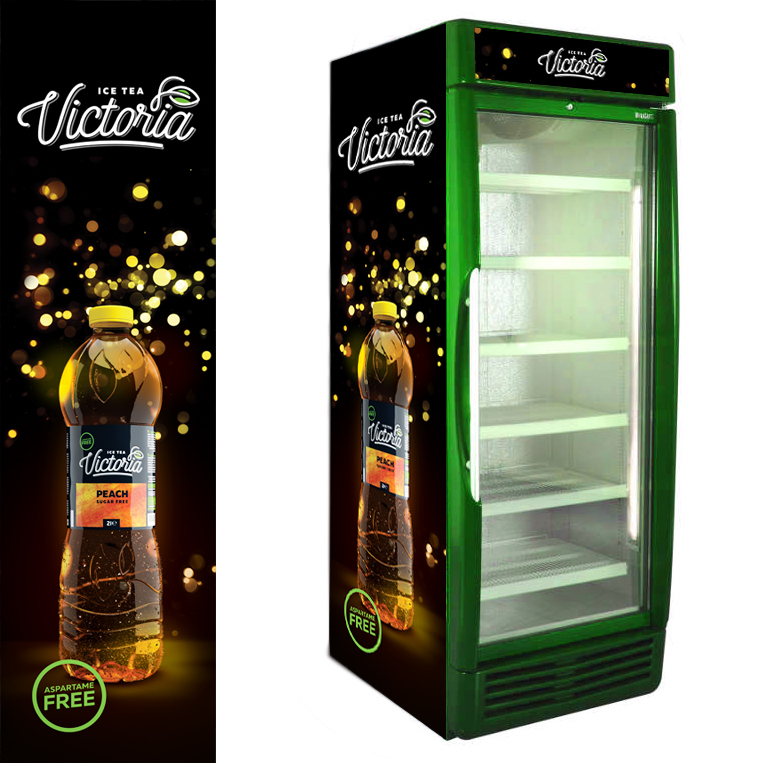
The Victoria visual identity extends beyond the bottle through branded refrigerated display equipment.
The retail graphics combine the product, logotype and dark visual background with bright accents, creating a consistent presentation across packaging and point-of-sale materials.
Let’s connect.
Open to UX/UI, product design and AI experience design opportunities.