KERI
A cohesive packaging system for a range of cream and processed cheeses.
The Project
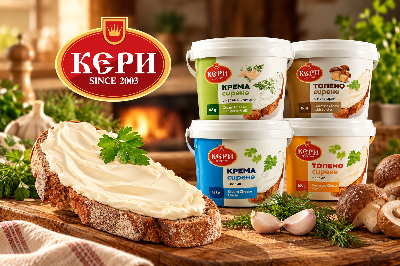
KERI is a dairy brand offering a range of cream and processed cheeses.
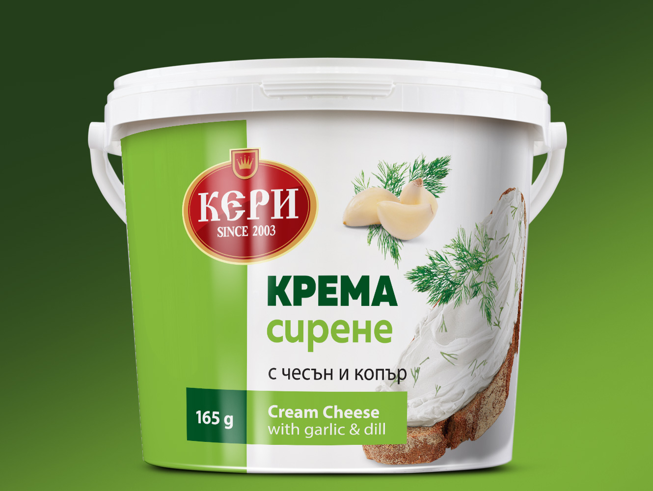
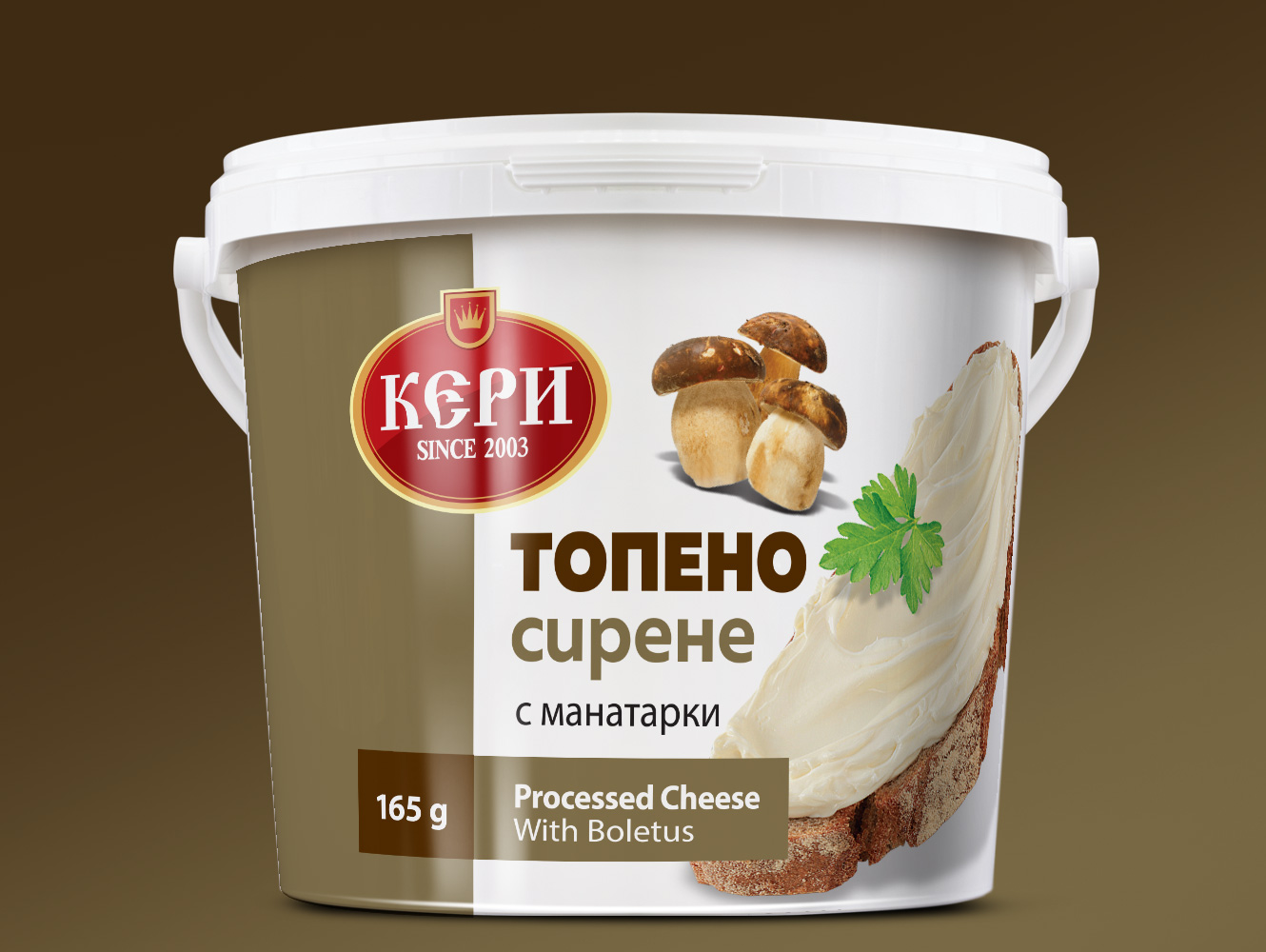
The packaging design brings different product varieties together through a consistent visual structure, combining clear typography, distinctive colours and appetising food imagery.
A Consistent Visual Language
The packaging combines a prominent red-and-gold brand emblem with clean white surfaces and colour-coded product information.
A consistent typographic hierarchy makes the product type easy to identify, while ingredient imagery and individual colour treatments distinguish each variety.
One Design System, Two Product Categories
The visual structure connects cream cheese and processed cheese under one recognisable packaging system.
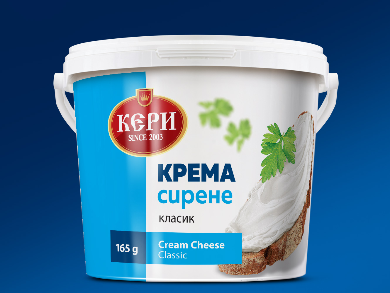
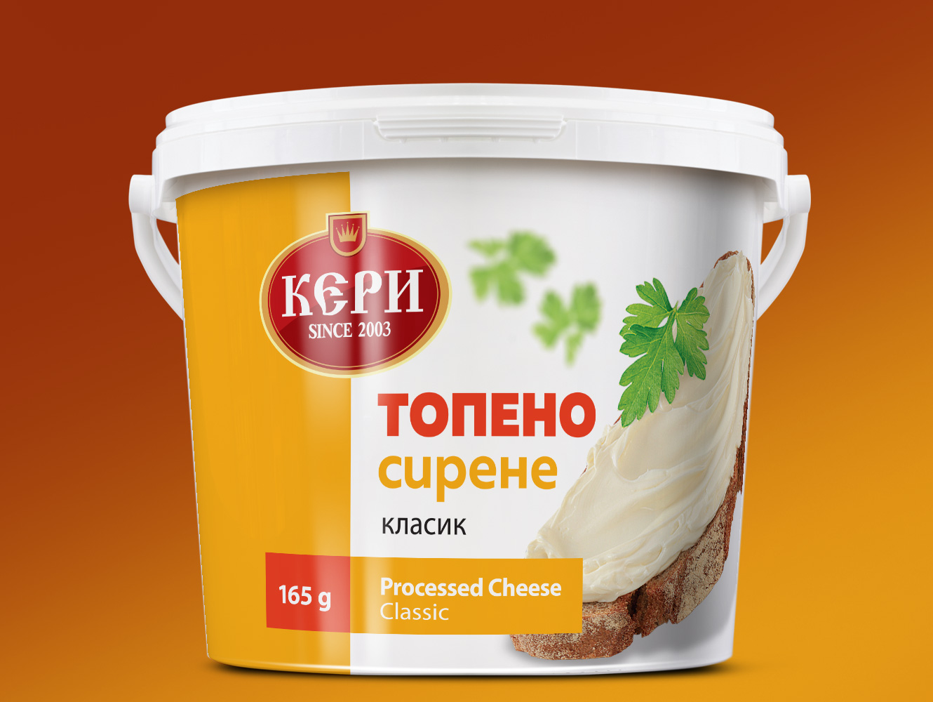
The brand emblem, product name, serving imagery and information panels maintain a consistent relationship, while typography and colour distinguish the two product categories.
Colour-Coded Product Varieties
Each product variation has its own colour identity, allowing customers to distinguish flavours and product types while recognising the KERI brand.
Let’s connect.
Open to UX/UI, product design and AI experience design opportunities.