
Display Daily
Responsive web platform for digital press subscriptions.
Project Snapshot
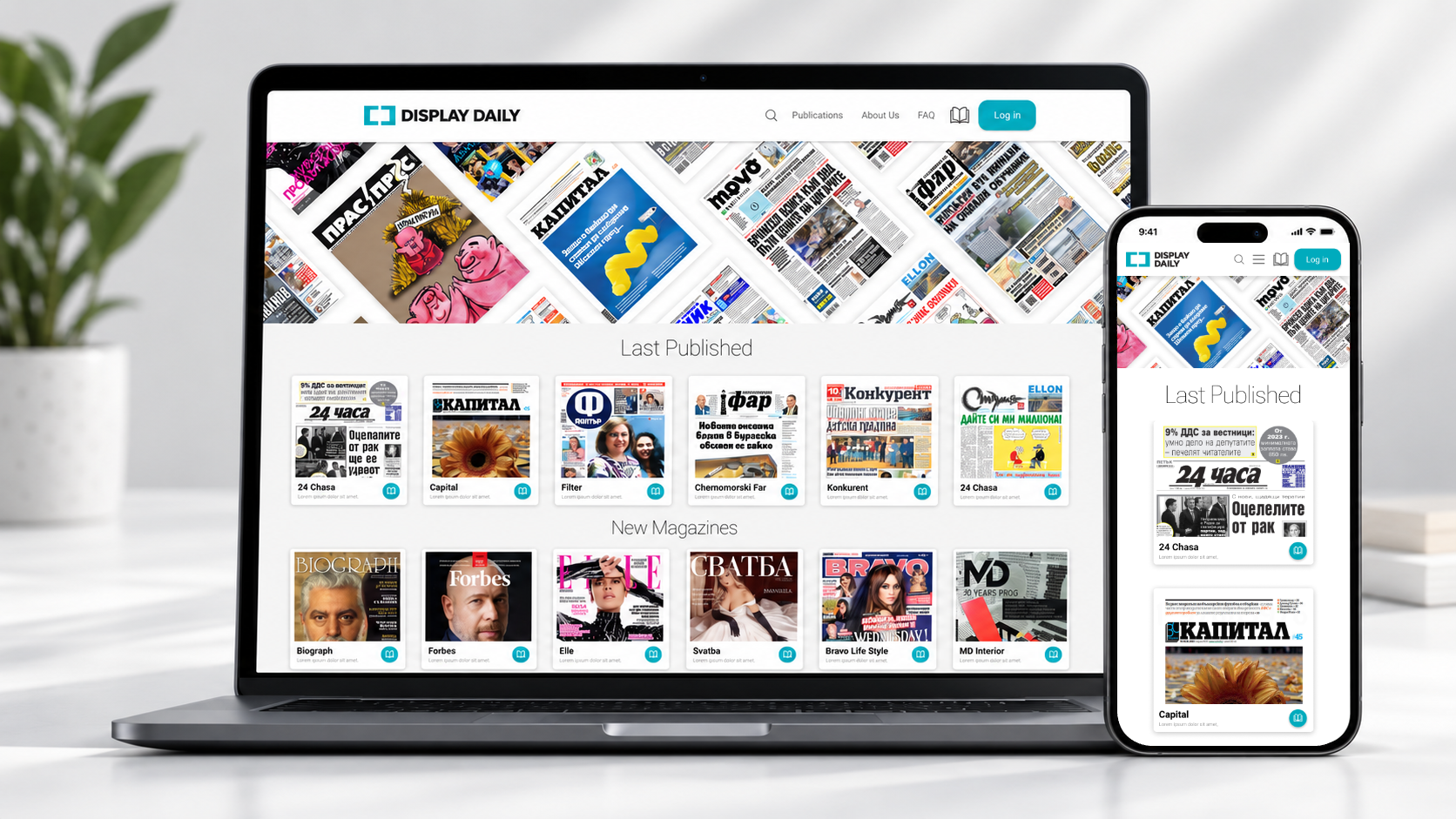
A responsive platform for subscribing to and reading digital versions of printed newspapers and magazines.
Readers, publishers, administrators, and B2B press monitoring users.
Make a content-heavy, multi-role platform clear and trustworthy.
Publication discovery, subscription flow, login/account clarity, payment flow, and responsive behavior.
Product Context
Display Daily allows readers to browse, subscribe to, search, and read digital publications. Publishers upload issues, while administrators review and manage publications and subscriptions.
Publishers deliver each issue as a PDF the day before it goes to print. Once reviewed, it becomes available to every subscriber on the platform.
Users & Roles
One platform, four groups with very different goals.
Reader
Finds, subscribes to, and reads publications.
Publisher
Uploads and manages digital issues.
Administrator
Reviews, approves, and controls platform content and subscriptions.
B2B / PR user
Searches across publications for press monitoring and media tracking.
From Wireframes to Tested Flow
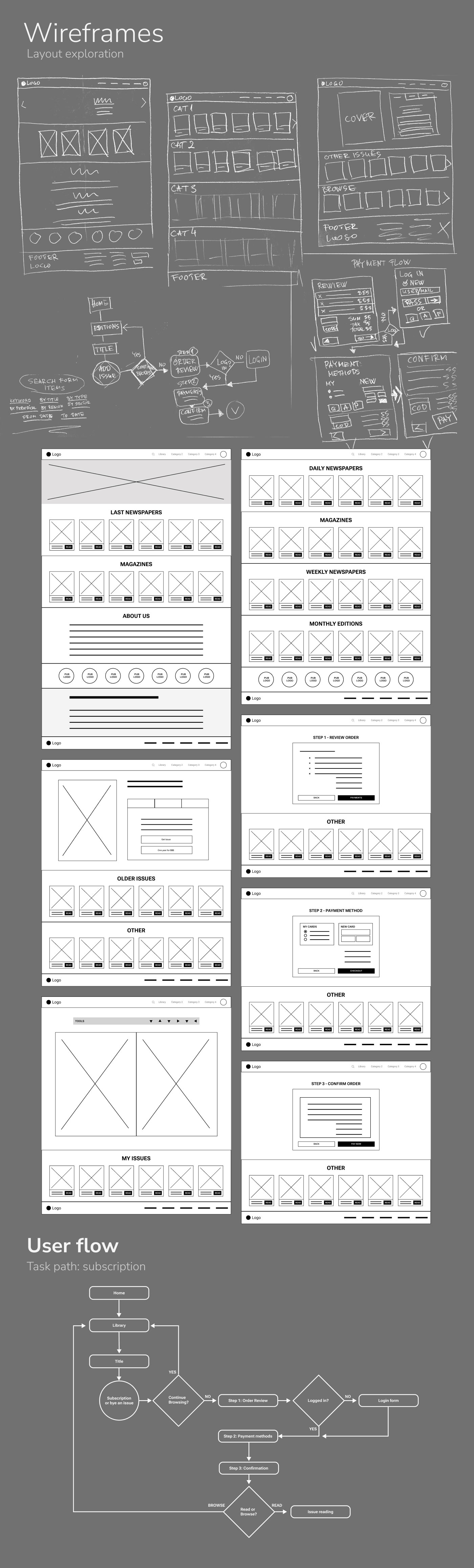
Layout exploration and the subscription task path were sketched first, then built into a low-fidelity prototype for testing.
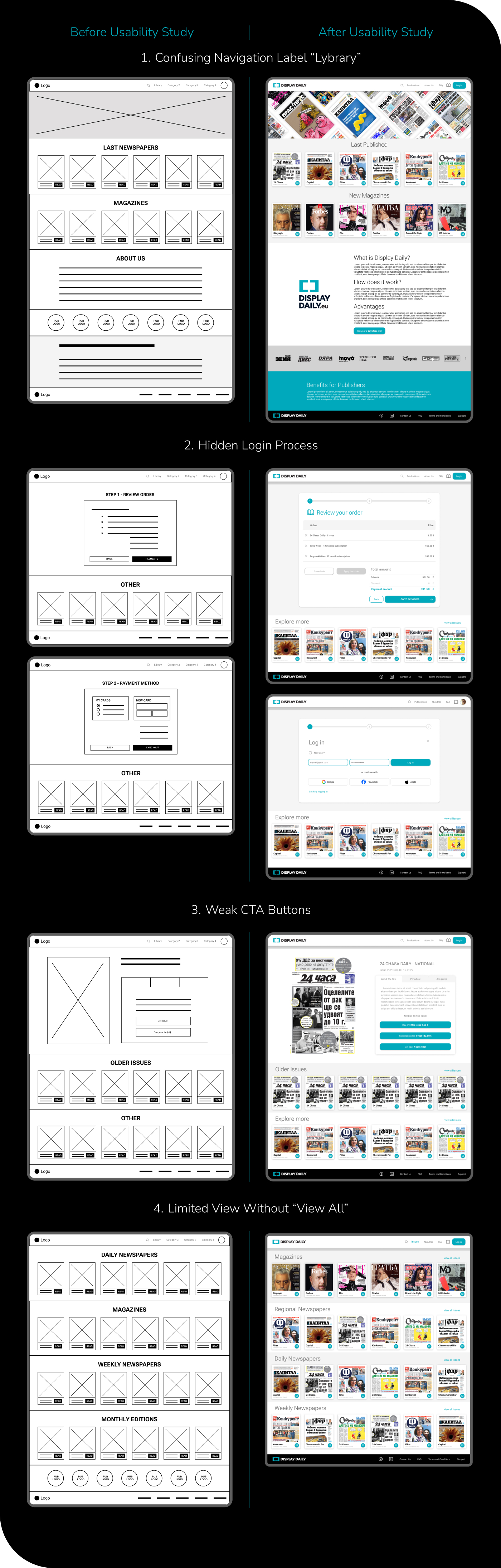
Usability Study → Design Decisions
The “Library” label was confusing.
Navigation terminology was revised toward “Publications” and clearer publication browsing language.
The login process was not clearly visible.
The flow needed clearer account and login context before purchase confirmation.
CTA labels were weak or unclear.
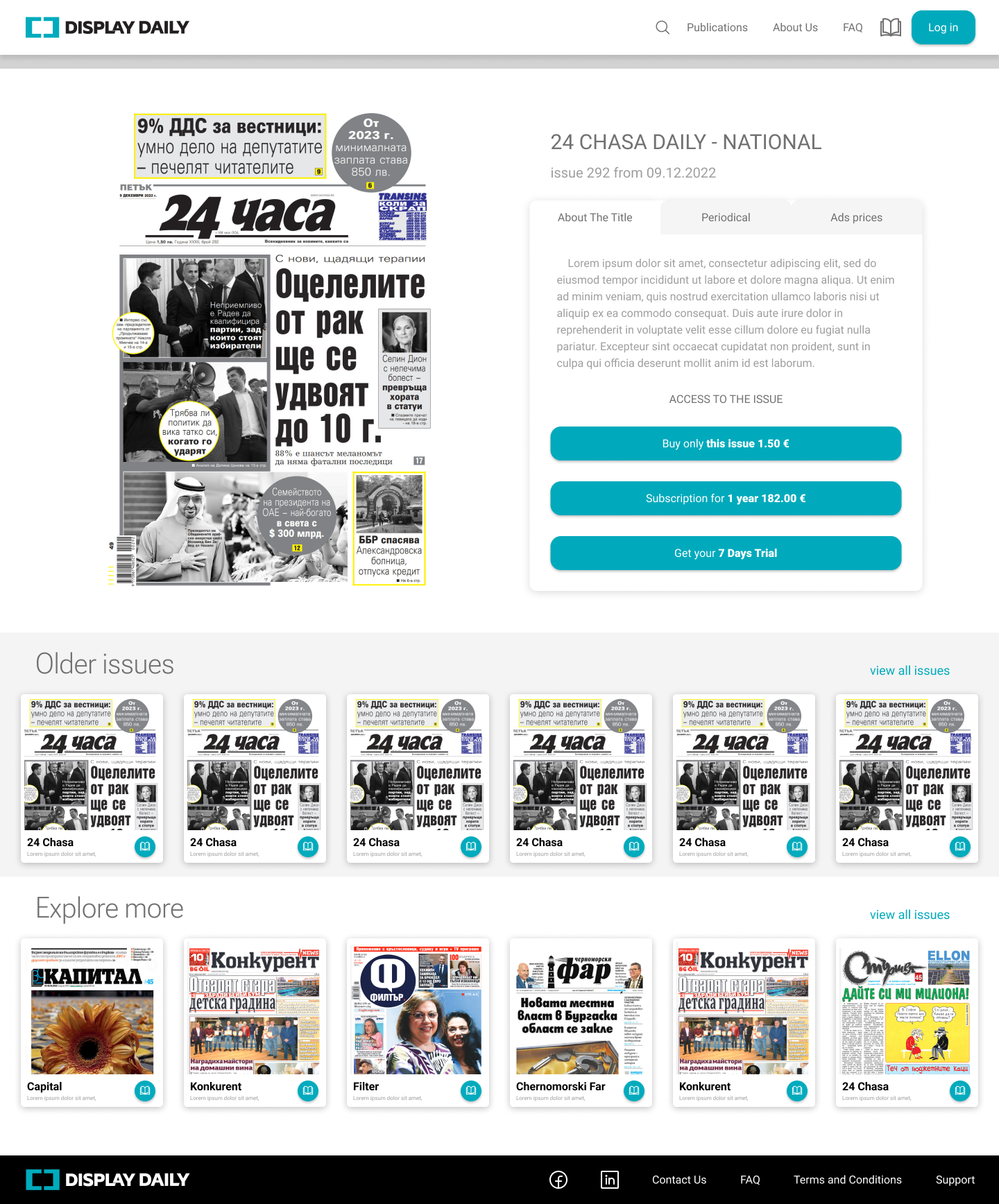
CTA hierarchy and wording were improved with clearer action labels such as “Subscribe Now” and “Buy This Issue”.
Users saw only limited content without a clear way to browse more.
The design introduced clearer “View all” and expanded browsing access.
Core UX Problems
Surfaced in a usability study on the low-fidelity prototype, testing browsing, subscription selection and payment.
Confusing navigation label “Library”
“Library? I thought it would be my saved stuff, not today’s newspapers.”
Hidden or unclear login process
“Wait, am I even logged in? Who is this subscription going to?”
Weak CTA buttons
“It didn’t look like something I could click.”
Limited view without “See all”
“It looks like there are just six — is that all?”
Unclear subscription ownership and payment flow
Users needed to know whose account a purchase belongs to before paying.
Before / After
Each of the four findings, traced from the tested low-fidelity screen to the revised design.
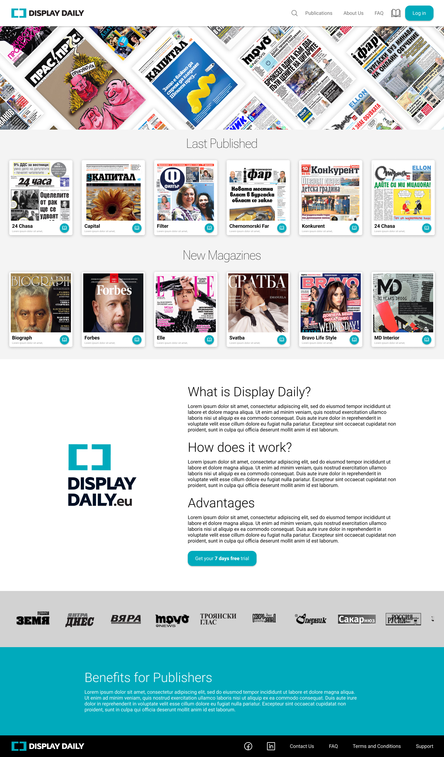
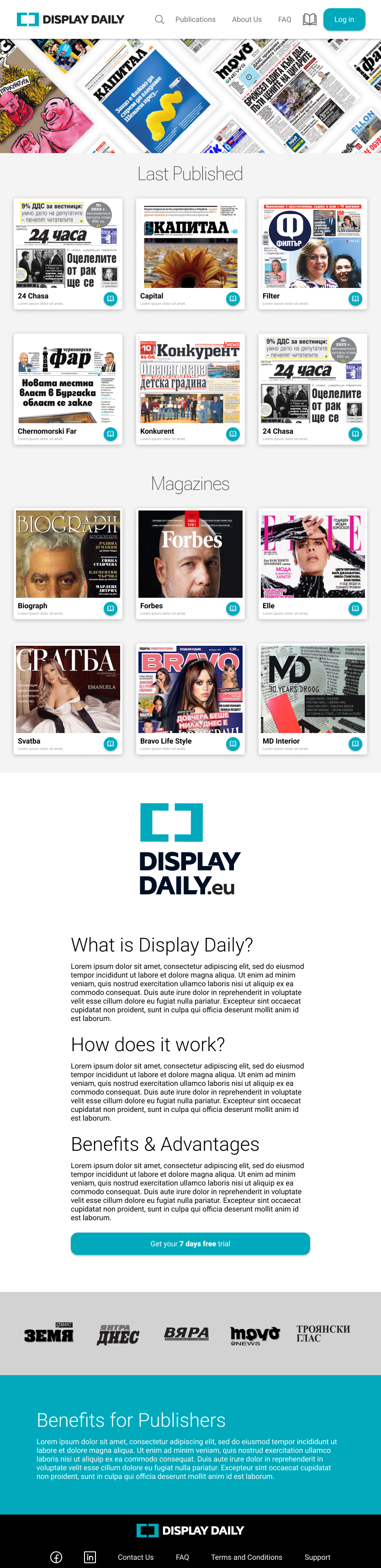
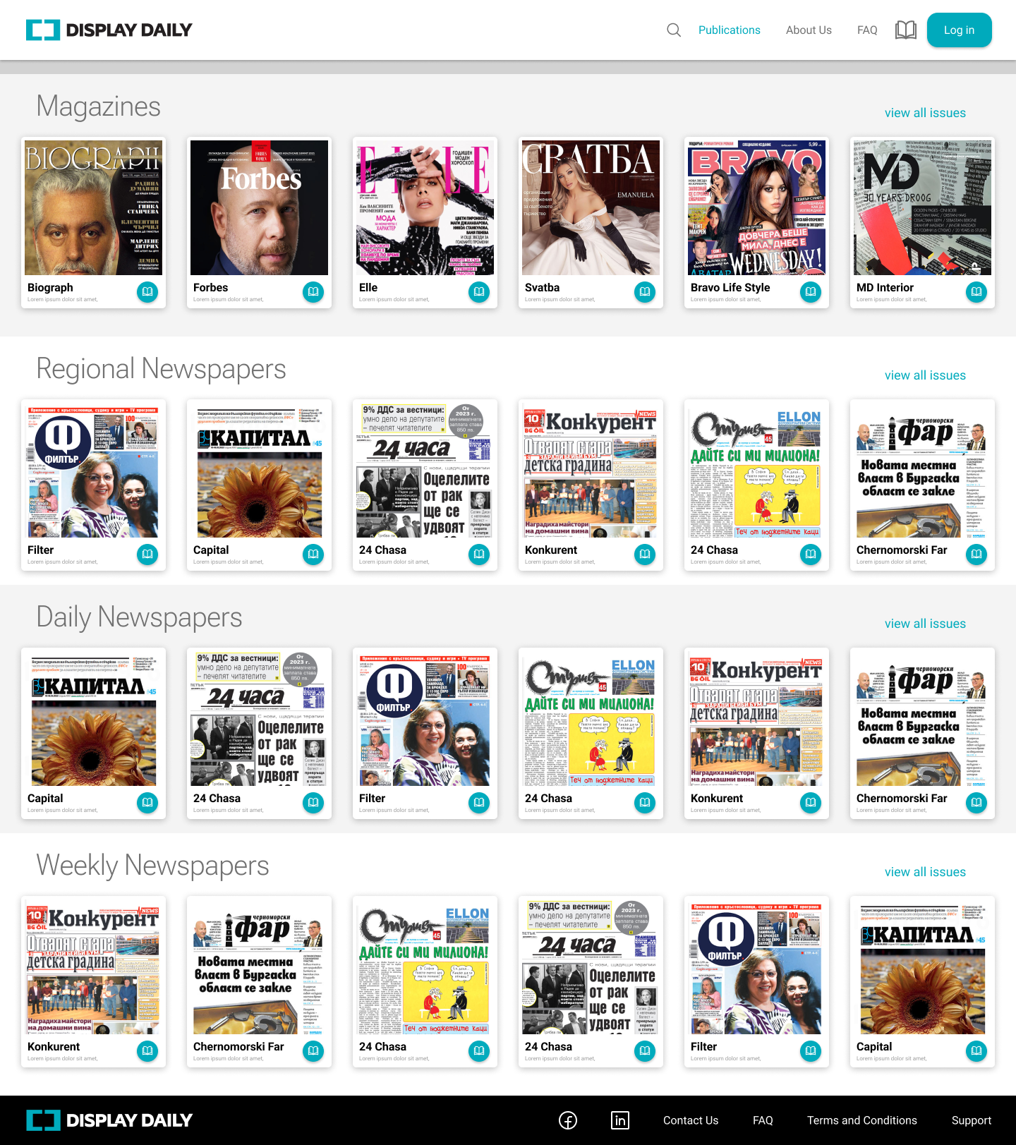
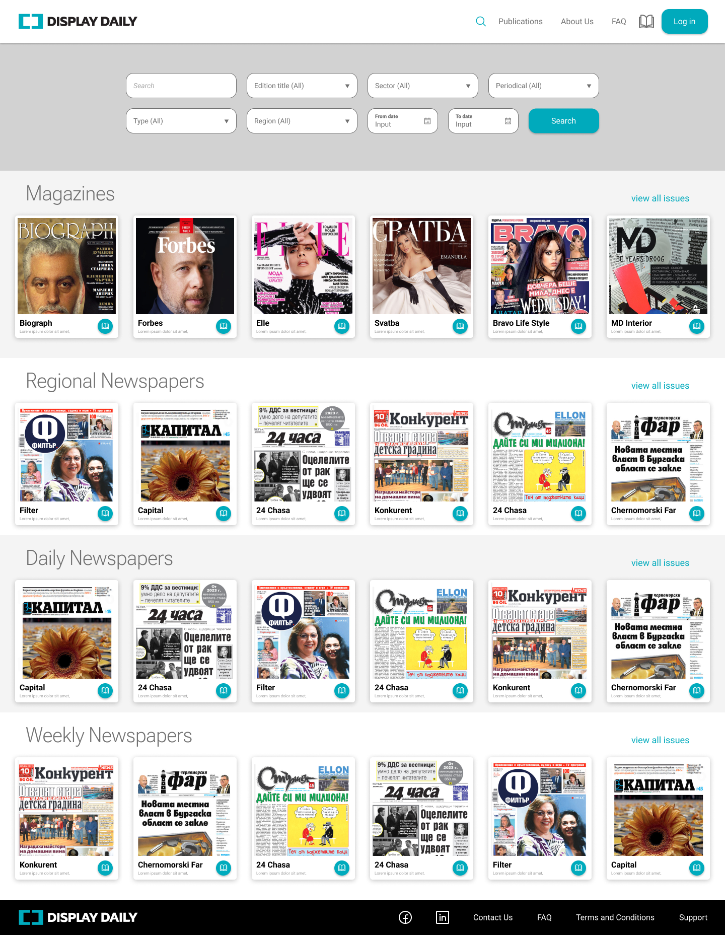
Final Responsive Interface
The same browsing, issue and checkout logic across desktop, tablet and mobile.

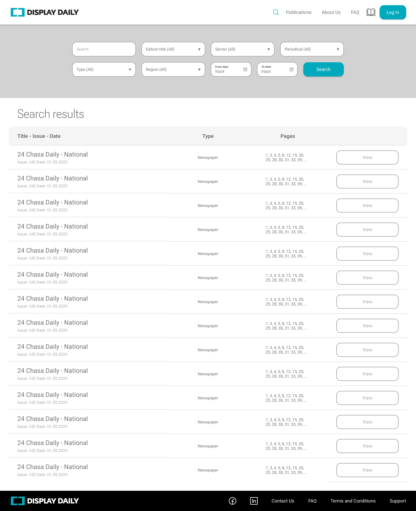
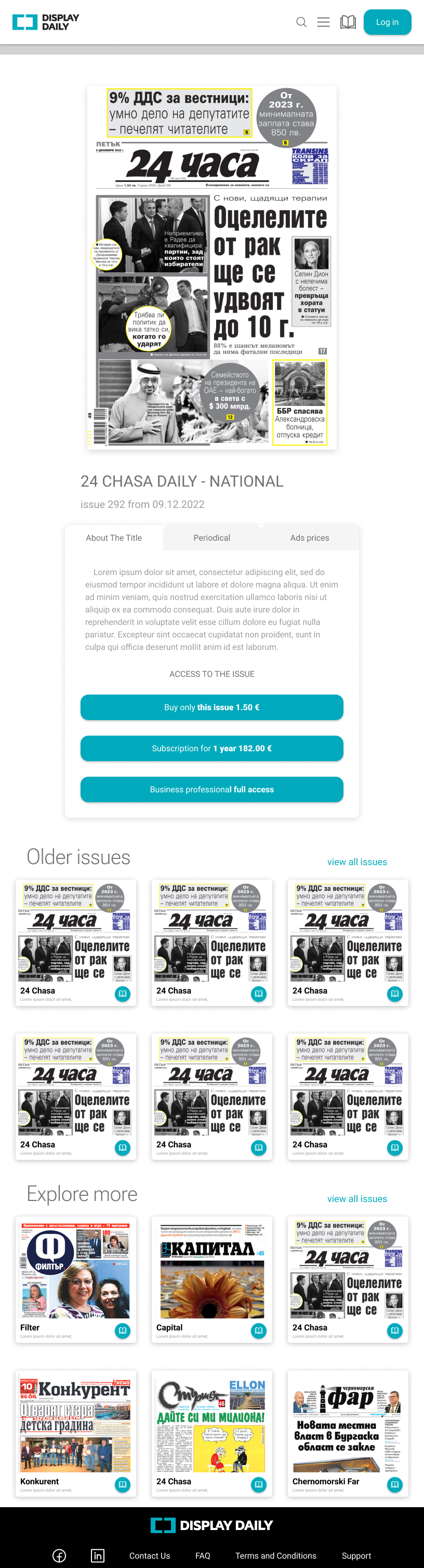




Responsive Form Design
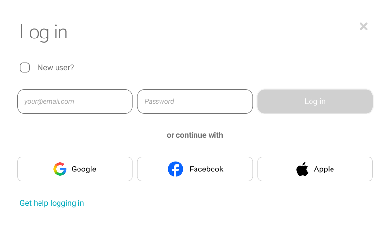
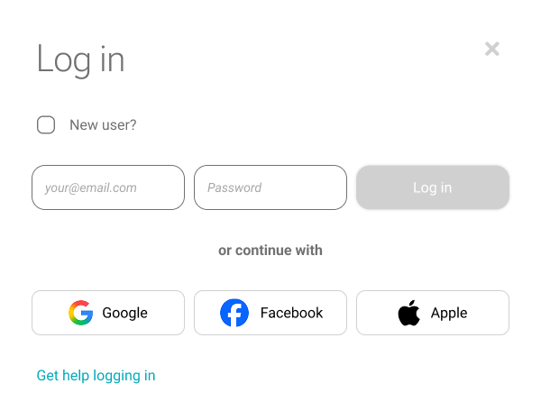
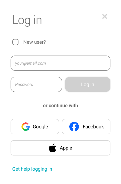
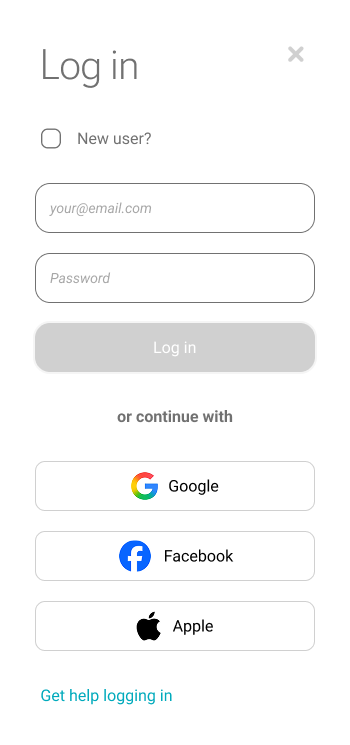
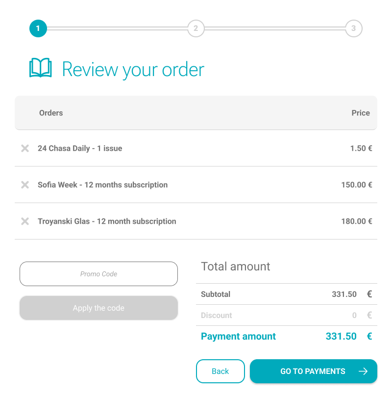
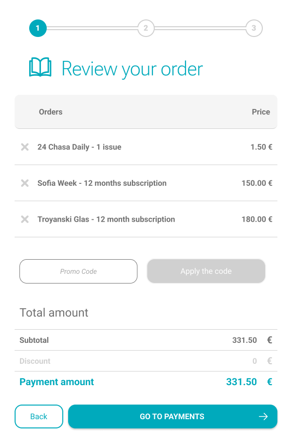
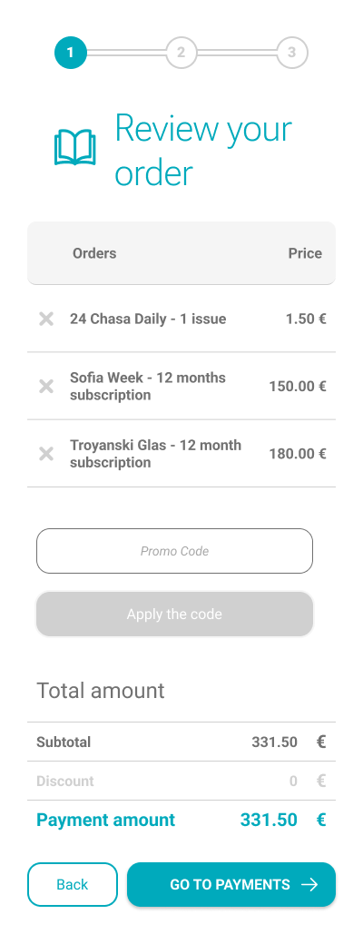
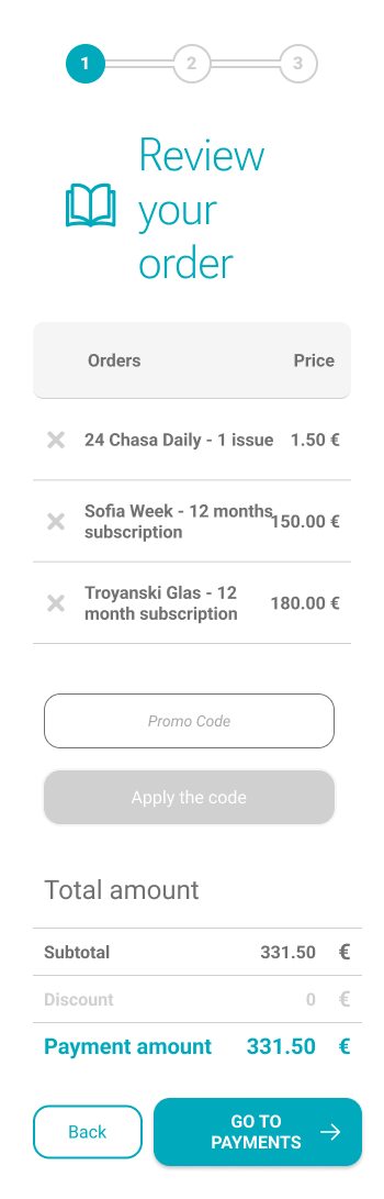
Two real Display Daily interface components — the login overlay and the order review screen — shown at four captured viewport widths, from 800px down to 350px.
01 — Log In Overlay
Email, password and the primary button collapse into one column as the viewport narrows. Social sign-in options move from three across to a stacked column by 350px.
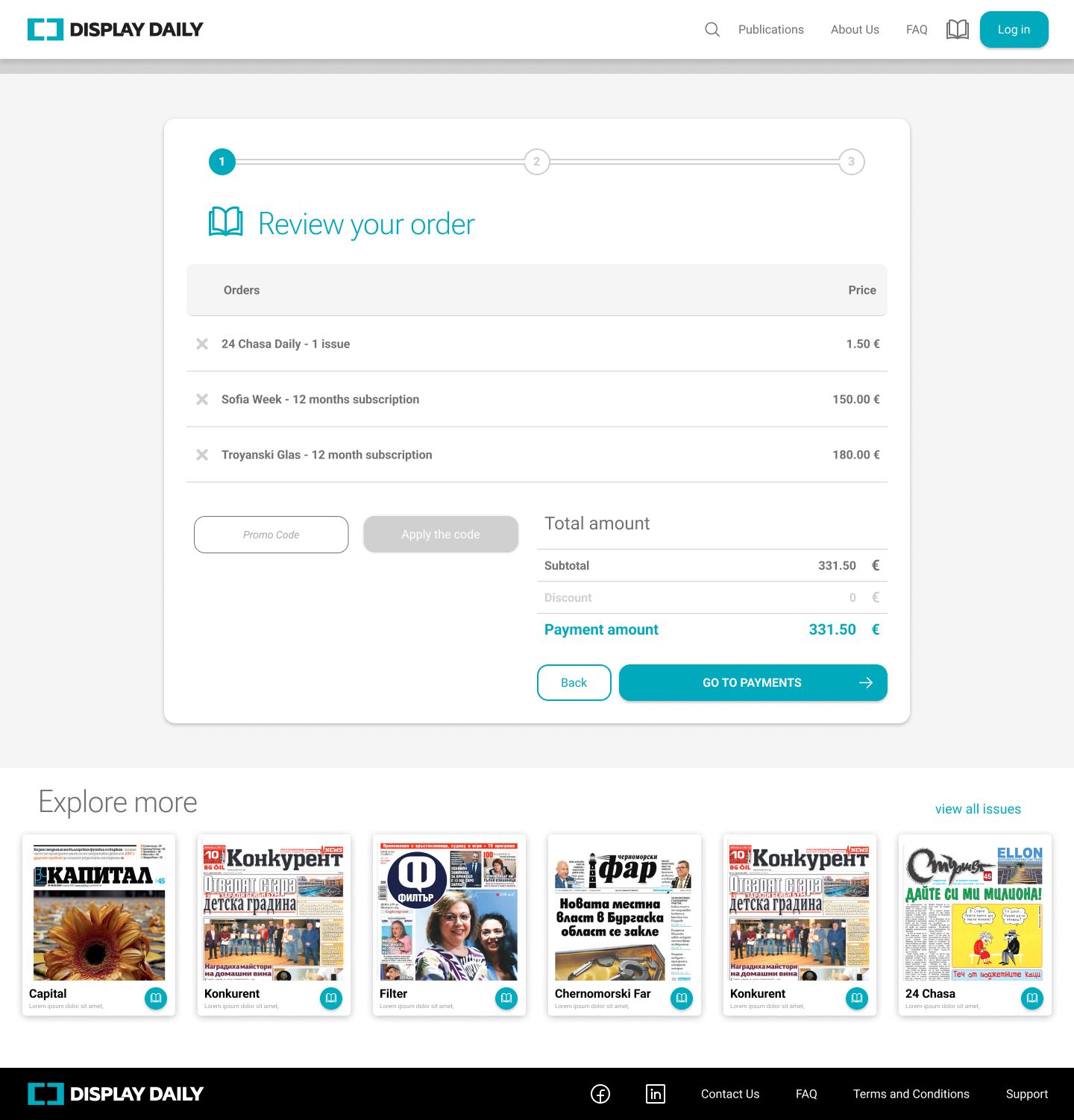
02 — Order Review
The order list stays full-width while the promo code and total amount shift from two columns to one. By 400px, every element in the screen runs in a single column.
Order & Checkout Flow
The sequence from reviewing a cart to a completed purchase, each screen produced by the same three-step progress indicator used throughout checkout.
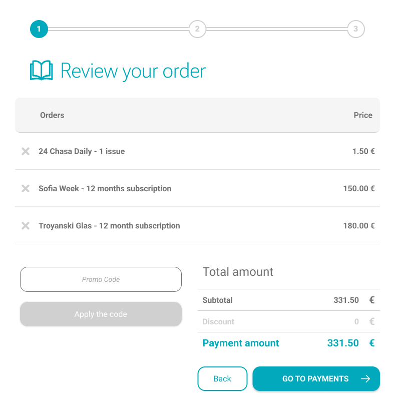
Review Order
The cart lists each selected issue or subscription with its price, next to a promo-code field and a running total. A three-step indicator above the list marks this as step 1 of 3.
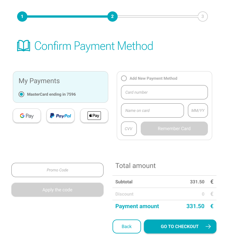
Confirm Payment Method
Users choose a saved card or an express option — Google Pay, PayPal or Apple Pay — or enter a new card’s details. The indicator advances to step 2 of 3.
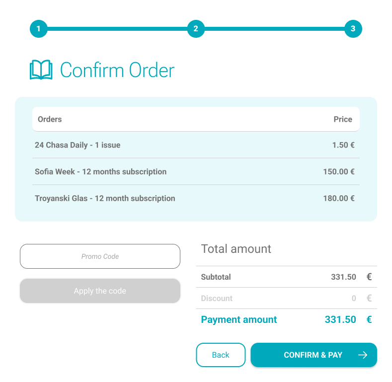
Confirm Order
The order and total are shown once more for a final check before payment, with the indicator completing step 3 of 3 and a primary “Confirm & Pay” action.
Purchase Confirmation
A success screen confirms the purchase and offers direct paths to start reading or continue browsing.

Accessibility
Color & contrast
Text and UI elements checked against WCAG contrast requirements.
Keyboard & focus
Interactive elements operable by keyboard, with clear focus indicators.
Responsive typography
Legible sans-serif type with scalable sizes across devices.
Labels & alt text
Action-oriented CTA labels and alt text to support screen readers.
Reflection
This project strengthened the structure of a multi-role responsive platform where clarity depends not only on visual hierarchy, but also on terminology, account status, subscription ownership, payment flow, and responsive behavior across devices.
Let’s connect.
Open to UX/UI, product design and AI experience design opportunities.