
DENITO
Packaging design for fresh salads and sauces, bringing distinctive visual approaches to two everyday food categories.
Designing Across Food Categories
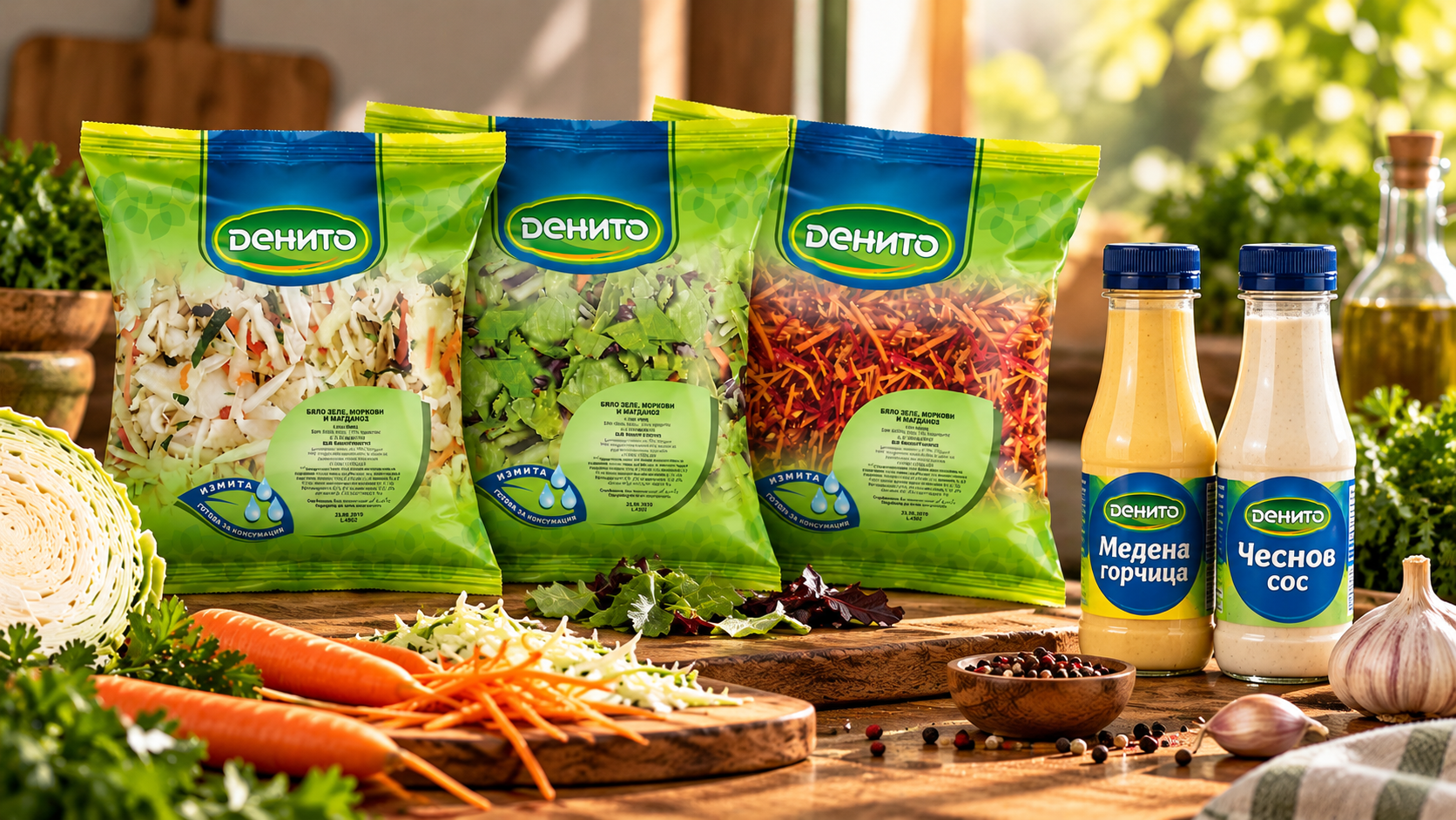
DENITO is a food brand represented through two distinct packaging applications: fresh salads and sauces.
The design work explores different ways of communicating freshness, product character and variety through colour, typography and packaging graphics.
Each category has its own visual approach, while maintaining the presence of the DENITO brand.
Freshness at First Glance
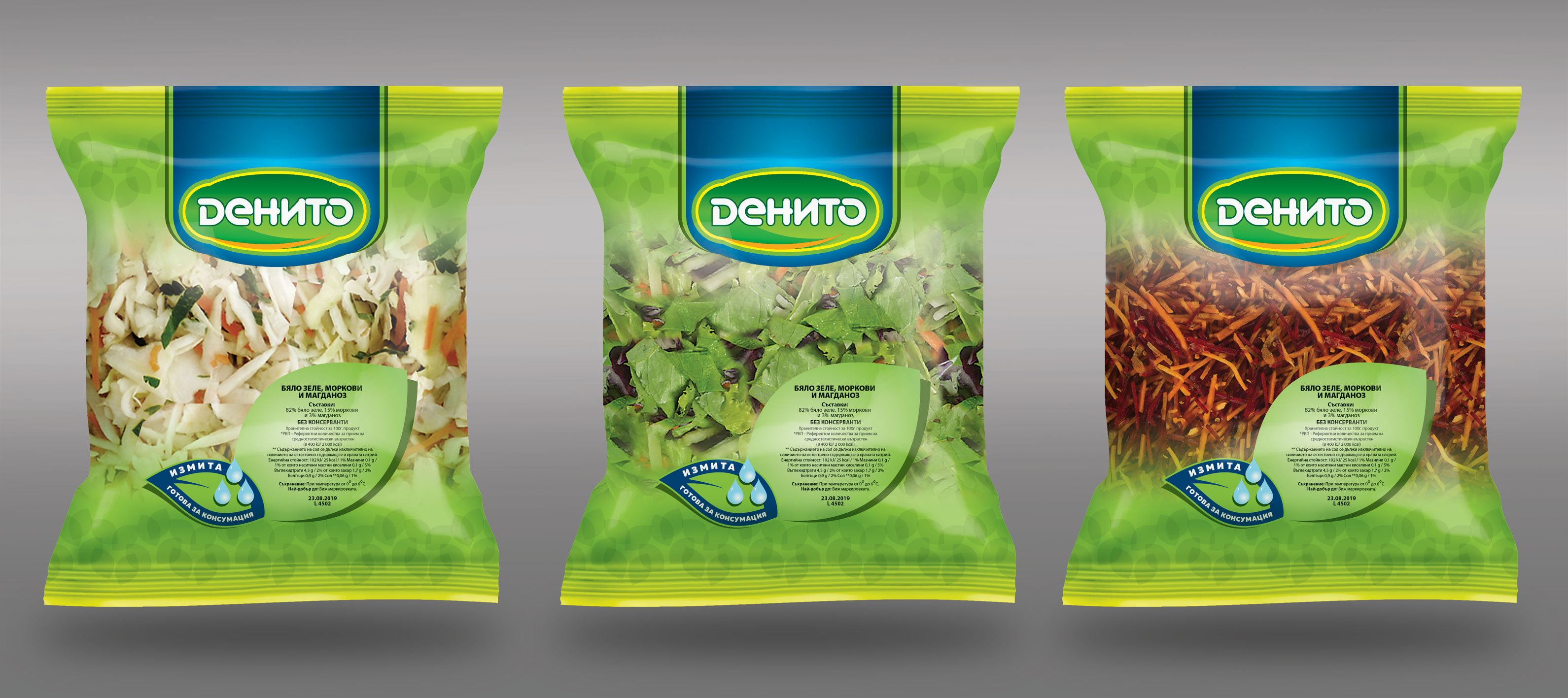
The salad packaging uses a fresh green visual language, combining botanical details with a clear presentation of the product.
The design balances the DENITO brand signature, product information and ready-to-eat messaging, allowing the food itself to remain a central part of the visual experience.
Across the range, colour and geometry establish visual hierarchy, with the packaging emphasising freshness and product visibility.
A Bold Packaging Language
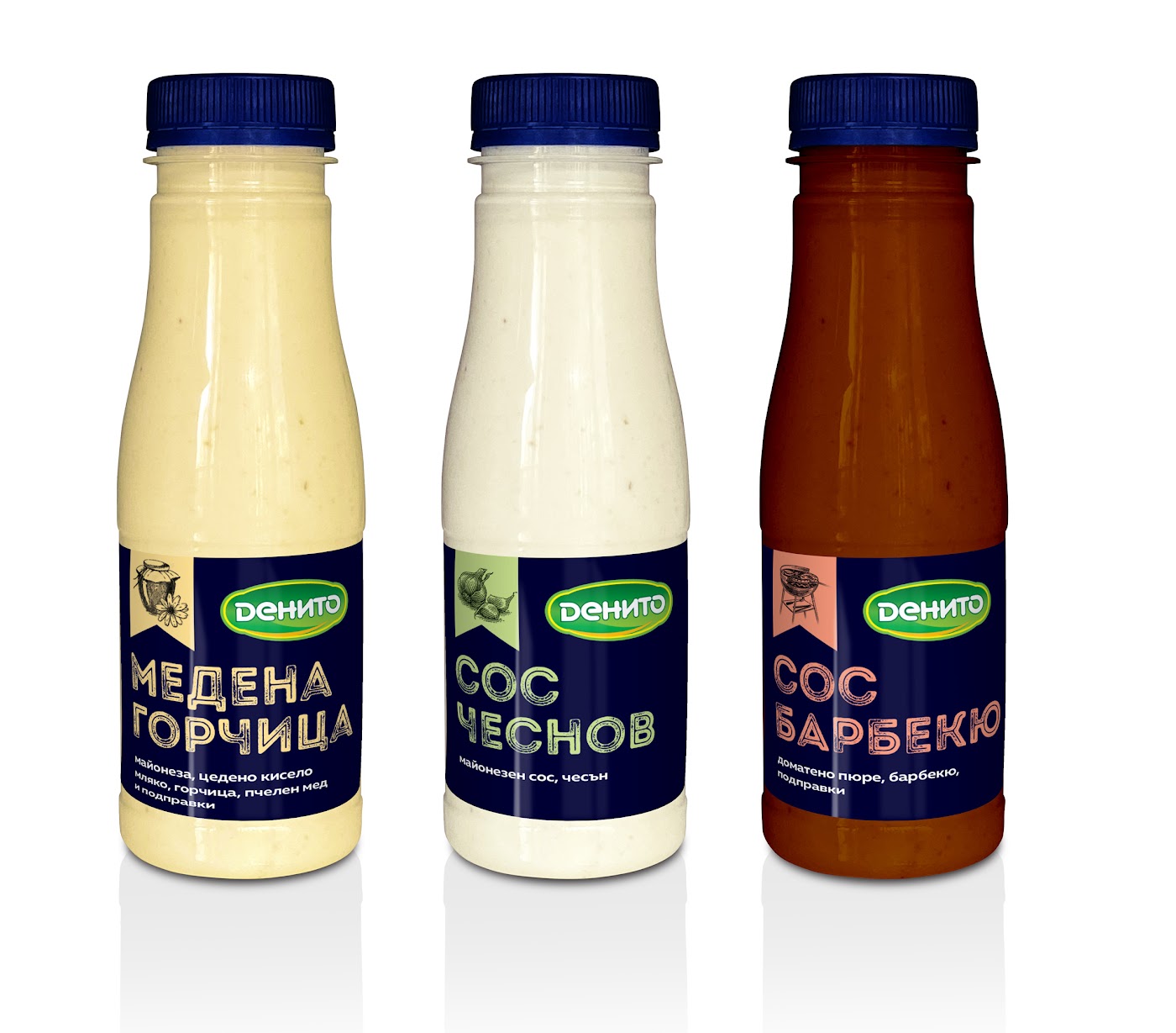
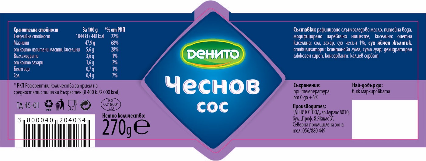
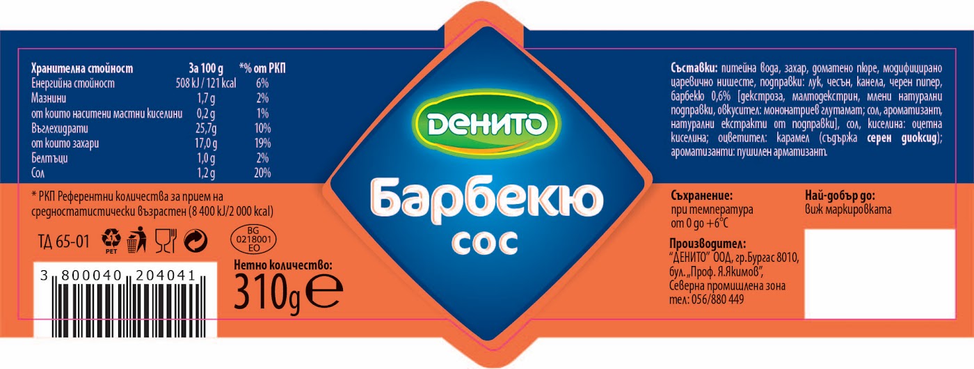
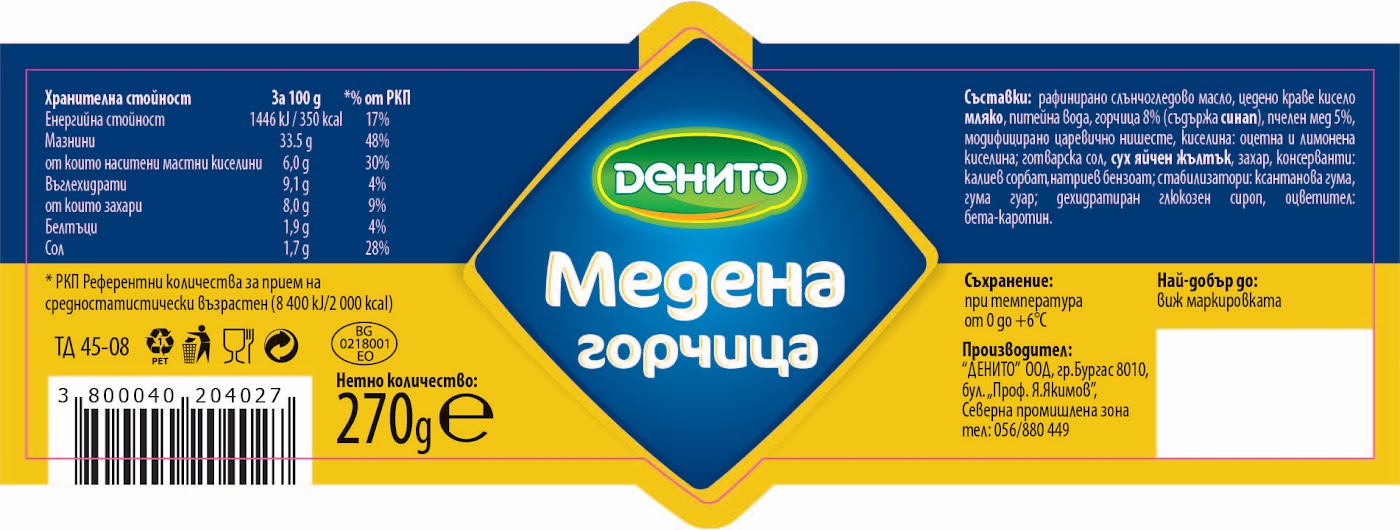
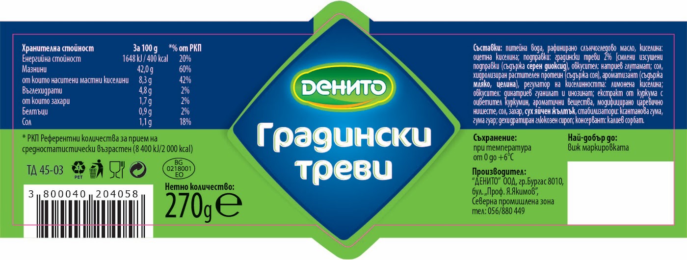
The sauce packaging explores a more expressive visual direction, using saturated blue, strong colour contrasts and a prominent central brand structure.
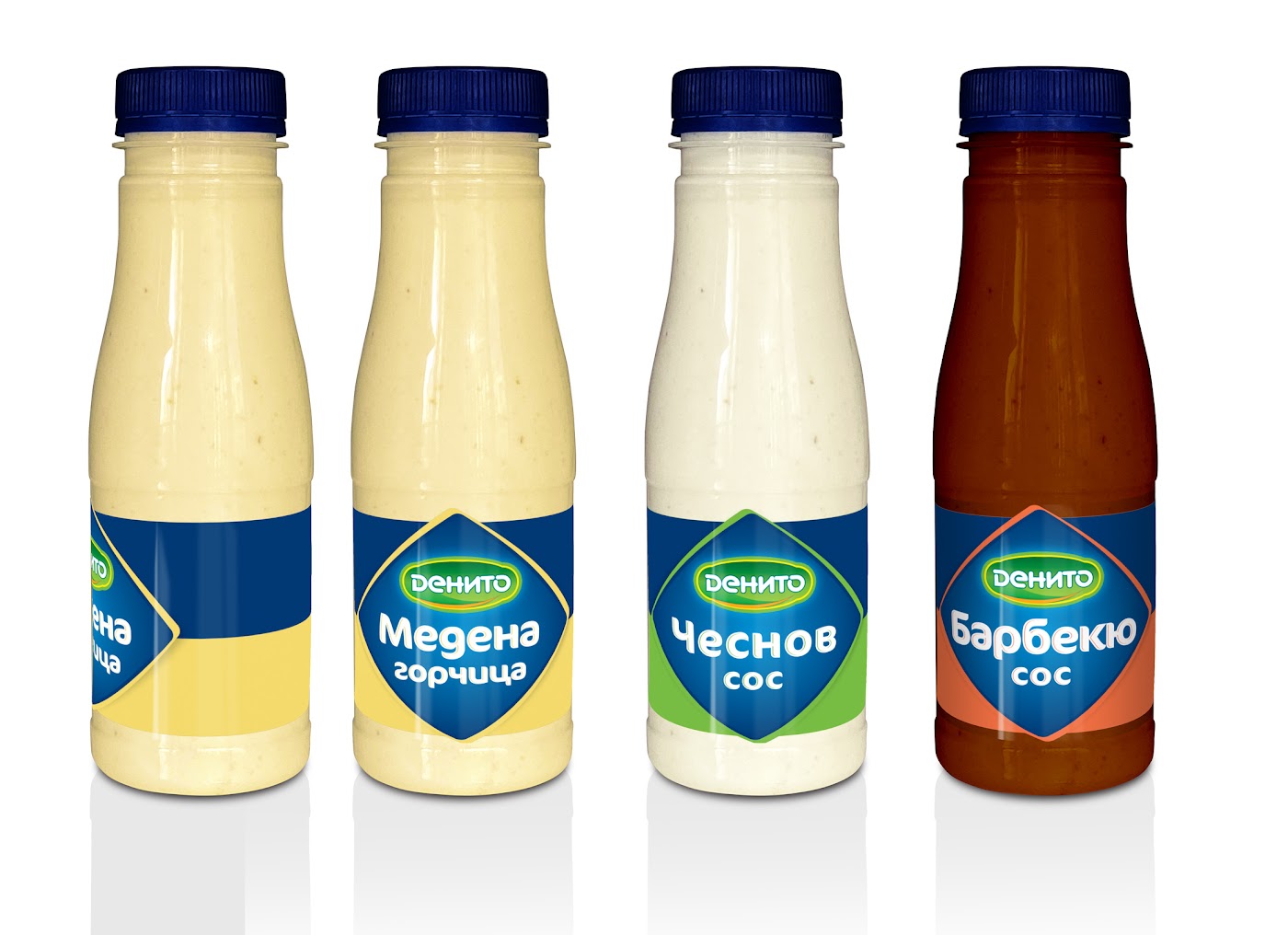
Distinctive label shapes and flavour-specific accents create a recognisable visual relationship across the sauce varieties. Two design directions are shown below.
Distinctive Flavours, Shared Identity
The label designs apply a shared graphic structure across different sauce varieties.
Individual colour treatments and clear product naming distinguish each flavour while maintaining a consistent visual relationship with the DENITO identity. A stronger graphic structure organises the brand, flavour names and supporting information.
Let’s connect.
Open to UX/UI, product design and AI experience design opportunities.