Mobile Grocery App · UX/UI Case Study
Grovia
A smoother way to shop for everyday groceries.
Grovia is a mobile grocery shopping experience designed around real shopping habits — discovering products, repeating familiar orders, completing checkout, and following delivery in one continuous flow.
Grocery shopping is repetitive. The experience should not be.
People often buy the same products week after week, yet many shopping apps make them search, select, and rebuild every order from the beginning. Grovia explores how a familiar household task can become faster, calmer, and easier to repeat.
“Less time rebuilding lists. More time for everyday life.”
The project at a glance
Grovia combines product discovery, favourites, shopping history, checkout, loyalty rewards, profile management, and delivery tracking in one mobile experience.
- Challenge
- Reduce repeated effort across everyday grocery shopping.
- Primary users
- Busy, price-aware people who regularly repurchase familiar products.
- Design objective
- Create a clear shopping flow that supports both discovery and repetition.
Familiar task. Repeated friction.
Buying groceries is routine, but the digital journey often includes unnecessary searching, repeated decisions, and uncertainty after checkout.
- 01
Rebuilding the same cart
Users repeatedly search for products they already purchase regularly.
- 02
Remembering everything
Manual lists and memory increase the chance of forgotten items.
- 03
Finding meaningful offers
Promotions are useful only when they are easy to notice and understand.
- 04
Waiting without context
After payment, users want to know what is happening with their order.
Understanding the user
Before designing screens, I looked at the routines behind them.
- Short user interviews
- Behavioural assumptions
- Competitive review
- Task analysis
Research simulation for a portfolio project — not verified real-world data.
What the research suggested
-
Shopping is repetitive
Many users buy a similar group of products every week.
-
Memory is not a shopping tool
People forget items or rebuild lists from scratch.
-
Offers need context
A lower price matters only when it is visible and easy to compare.
-
Delivery creates uncertainty
After checkout, users want clear and timely progress information.
Primary persona
Elena · 38
Marketing manager · Household of four
“Most weeks I buy the same things. I shouldn’t have to start from zero every time.”
- Goals
- Shop for the household quickly, reuse familiar orders, and catch good-value offers.
- Frustrations
- Rebuilding lists each week, forgetting items, and unclear delivery status.
- Habits
- Shops once or twice a week on mobile and saves favourites.
- Scenario
- Between meetings, she reorders the weekly basket and schedules an evening delivery.
Where the effort builds up
The journey showed that much of the friction happens before payment — while planning, remembering, searching, and rebuilding a familiar order.
- Plan
- Action
- Thinks about what the household needs this week.
- Thinking
- “What are we out of again?”
- Friction
- Relies on memory.
- Opportunity
- Surface previous lists.
Unsure
- Search
- Action
- Opens the app and searches product by product.
- Thinking
- “I buy these every week.”
- Friction
- Repetitive typing.
- Opportunity
- Reuse familiar orders.
Tedious
- Compare
- Action
- Checks prices and offers across items.
- Thinking
- “Is this actually a deal?”
- Friction
- Offers are easy to miss.
- Opportunity
- Clearer price hierarchy.
Cautious
- Add
- Action
- Adds items one by one to the cart.
- Thinking
- “Did I forget anything?”
- Friction
- No sense of completeness.
- Opportunity
- List-based building.
Effortful
- Pay
- Action
- Moves through checkout and payment.
- Thinking
- “How many steps are left?”
- Friction
- Unclear progress.
- Opportunity
- Visible step structure.
Tense
- Wait
- Action
- Waits for the order after paying.
- Thinking
- “Where is my order now?”
- Friction
- No status after payment.
- Opportunity
- Persistent tracking.
Anxious
A busy grocery shopper needs a faster way to rebuild recurring orders because searching for the same products every week wastes time and increases the chance of forgetting something.
How might we make repeat grocery shopping feel almost effortless?
Three principles, three interface decisions
-
Find faster
Clear categories, filters, promotions, and visual product cards reduce unnecessary searching.
-
Repeat easily
Favourites and previous shopping lists help users begin with something familiar instead of starting again.
-
Stay informed
Order confirmation and delivery tracking reduce uncertainty after payment.
A structure built around shopping habits
Frequent actions stay within reach in the bottom navigation, while personal settings and support tools remain inside the profile area.
Grovia
Primary navigation
- Home
- Favourites
- Shop
- History
- Cart
Account area
- Profile
- Addresses
- Billing
- Payment Methods
- Settings
- Accessibility
- Help Centre
- Sign Out
Supporting flows
- Login
- Registration
- Password recovery
- Checkout
- Delivery tracking
Core user flows
Core shopping flow
- Home
- Category
- Products
- Product Details
- Cart
- Delivery Details
- Payment Method
- Order Review
- Order Confirmation
- Delivery Tracking
Repeat-order flow · Grovia’s defining idea
- Shopping History / Favorites
- Select
- Load Selected
- Review Cart
- Checkout
“Yesterday’s shopping list can become today’s cart without rebuilding it item by item.”
Starting the design
Before adding colour and personality, I focused on structure, task order, and decision points.
Structure before decoration
The first wireframes reduced the experience to its essential actions: finding products, building a cart, reusing a list, paying, and tracking an order.
-
Home
-
Product listing
-
Shopping history
-
Checkout
Early structure
Final interface
Testing the journey before polishing the UI
The low-fidelity prototype connected the core screens into realistic tasks, allowing the flow to be evaluated before investing in detailed visual design.
- Find a product
- Add it to favourites
- Add products to the cart
- Reuse a previous list
- Complete checkout
- Locate delivery information
Small moments of confusion revealed the biggest opportunities.
The low-fidelity prototype was tested through realistic grocery-shopping tasks. Observations and think-aloud feedback helped identify points of hesitation and unnecessary effort.
-
Finding 01 · Reusing a previous order
Reusing a previous order
“I found yesterday’s list, but I wasn’t sure how to put it back in my cart.”
Insight
The history screen showed past lists, but the next action was not sufficiently clear.
Design response
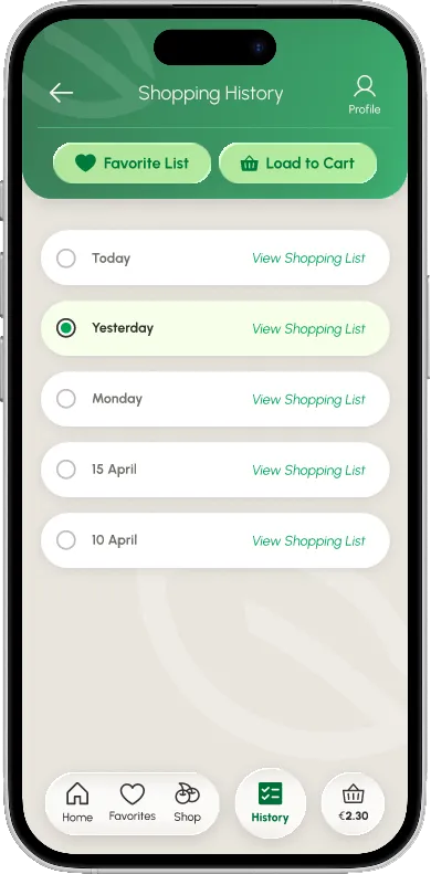
Added a clear selected state and a contextual “Load Selected List” action.
-
Finding 02 · Checkout orientation
Checkout orientation
“I know I’m checking out, but how many steps are left?”
Insight
Users needed a stronger sense of progress during checkout.
Design response
Added a visible three-step checkout indicator.
-
Finding 03 · Delivery visibility
Delivery visibility
“The order is confirmed. Where can I see what happens next?”
Insight
Confirmation alone did not provide enough reassurance.
Design response
Added the “Track Your Delivery” CTA and persistent delivery progress.
-
Finding 04 · Promotion hierarchy
Promotion hierarchy
“I saw the price, but I almost missed that it was a special offer.”
Insight
Promotion labels and price differences needed stronger hierarchy.
Design response
Strengthened the Best Price badge, sale price, and contrast.
Feedback became visible design decisions
-
Before
Previous lists appeared as passive history records.
After
Radio-button selection and “Load to Cart” action clarify reuse.
-
Before
Checkout screens felt disconnected.
After
A three-step progress indicator creates orientation.
-
Before
Order confirmation ended the journey.
After
A clear tracking CTA continues the experience.
-
Before
Promotional information competed with the rest of the card.
After
Colour, size, and placement strengthen the price hierarchy.
Fresh, friendly, and familiar
The visual language combines natural greens with warm neutral surfaces. Rounded components and generous touch areas make the interface feel approachable, while stronger accent colours help prices and promotions stand out.
Colour
- Deep green #1B7A43
- Mid green #3DA35D
- Fresh green #8BD24A
- Warm neutral #EFEBE2
- Promotion red #C7264B
- Highlight yellow #F6BE45
Buttons & states
Typography
Nunito Sans — clear, rounded, friendly
Used across the product interface for labels, prices and body.
From routine task to connected experience
The final interface follows the complete journey — from account setup and product discovery to checkout and delivery.
Account setup
A clear beginning
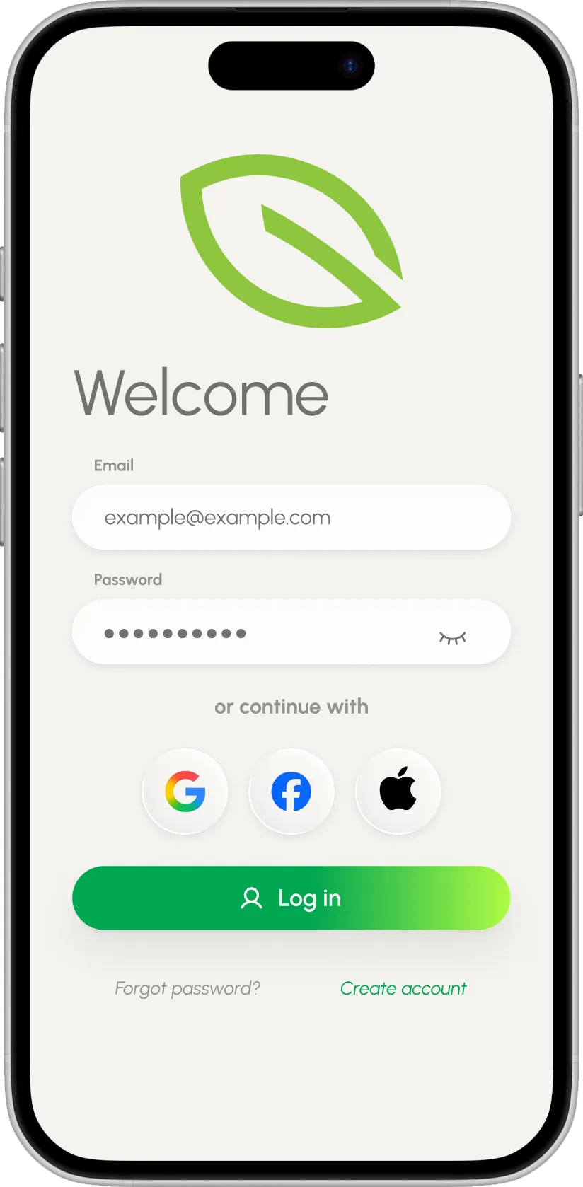
Login, registration, password recovery, and email confirmation use familiar patterns and consistent guidance.
-
Consistent forms reduce learning between account-related tasks.
-
Product discovery
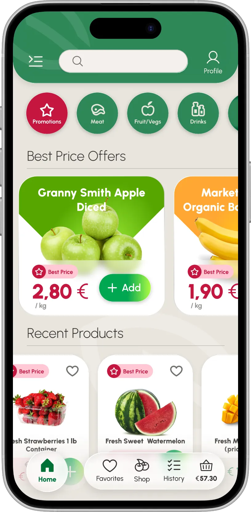
Find what you need
The home screen balances promotions, categories, and recent products without forcing users into a single browsing path.
Offers without searching.
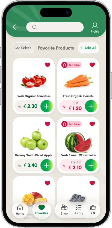
Best-price promotions and recent products surface on the home screen, so a familiar basket is only a tap away.
-
Categories built for quick scanning
-
Filters that narrow the choice
-
Product listing at a glance
-
Product details before commitment
Repeat shopping
Start from something familiar
Favourites and previous shopping lists help users prepare the next order without repeating every decision.
“Yesterday’s list can become today’s cart in one clear action.”
A selected radio state marks the chosen list, and a single Load to Cart control returns it to the basket — no item-by-item rebuilding.
Checkout
One decision at a time
Checkout is divided into three focused steps, helping users understand where they are and what comes next. A three-step progress indicator stays visible throughout.
-
Step 1 · Delivery details
Saved addresses reduce repeated typing.
-
Step 2 · Payment method
Multiple payment methods remain easy to compare.
-
Step 3 · Confirm order
The final review prevents accidental confirmation.
Order confirmation
Checkout is complete. Reassurance continues.
A successful payment should not leave the user wondering what happens next.
Clear confirmation, a direct Track Your Delivery next step, and no dead end.
Delivery tracking
Confidence after payment
Delivery progress remains visible across the experience, allowing users to check the current status without searching through menus.
- Order Confirmed
- Packed & Ready
- On the Way
- Delivered
-
A persistent delivery bar on Home
-
Full status inside the profile
Profile & control
Personal details in one place
The profile brings together loyalty points, delivery addresses, payment methods, active orders, settings, and support.
- Loyalty programme
- Address management
- Payment methods
- Accessibility settings
- Active delivery status
Designed as a system, not a collection of screens
Reusable components, variables, overlays, and interactive states helped keep the prototype consistent and realistic.
- Interactive buttons
- Favourite toggle
- Selected radio states
- Quantity controls
- Navigation active states
- Checkout progress
- Slide-in profile menu
- Delivery status changes
- Form interactions
Built in Figma with variables, overlays, responsive components, and realistic interactive forms.
Clear for more people
Accessibility was treated as part of everyday usability, not as a final visual adjustment. Designed with WCAG principles in mind.
-
Readable contrast
Text, prices, and controls maintain clear separation from their backgrounds.
-
Generous touch targets
Primary controls and navigation items are designed for comfortable mobile interaction.
-
Visible states
Selected, active, favourite, progress, and error states are communicated visually.
-
Clear language
Buttons and forms use direct labels that describe the expected action.
What the final experience achieves
-
Faster repeat orders
Favourites and shopping history reduce repeated searching.
-
Clearer checkout
A visible step structure supports confident decisions.
-
More transparent delivery
Confirmation and tracking keep users informed after payment.
Grovia turns a repeated household task into a calmer, more predictable routine.
This project helped me explore how thoughtful navigation, reusable shopping lists, clear feedback, and realistic prototyping can make an everyday product feel genuinely helpful.